- Home
- IELTS Forum
- Graph Feedback
IELTS Task 1 Writing: Graph Feedback
Here you can post your own Task 1, such as a graph, pie chart or letter, so other IELTS students can comment on it.
If you post, please make sure you attach a copy of the graph or diagram. Without this, your writing will not be posted.
Below some of them are comments by myself on the writing so you can see the strong and weak points of each piece of writing.
This is useful as a guide to help you in preparation for the test.
Please note that I will not likely be able to comment on any more submitted - it is for other visitors to the site to comment if they would like.
Submit your graph or diagram:
Post your writing here
What Other Visitors Have Said
Click below to see contributions from other visitors to this page...
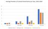
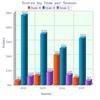
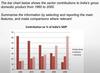
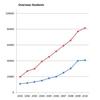
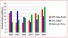
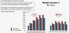
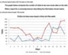
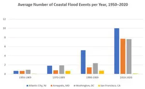
IELTS Bar Chart: Average Number of Coastal Flood Events per Year
The chart below shows the number of flood events in four different cities in the United States during four different periods.
The bar graph depicts …
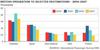
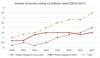
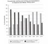
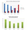
Bar Chart: Owned and Rented Accommodation England and Wales
The given bar chart compares the proportion of households that owned and rented accommodation in England and Wales from 1918 to 2011.
Overall, most …
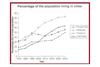
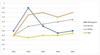
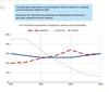
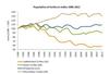
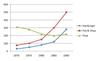
IELTS Line Graph: Population Living in Cities
This line graph illustrates the percentage of people living in cities in four Asian countries— the Philippines, Malaysia, Thailand, and Indonesia— from …
IELTS Line Graph: Governments Expenditure on Research
The line graphs show information about the US government's expenditure spending on research in five fields ( health, space, energy, general science, and …
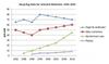
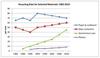
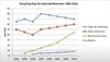
IELTS Graph: Recycling Rate for Four Selected Materials
This line chart presents the percentage of diverse materials subjected to recycling from 1982 to 2010 in a specific nation.
Overall, there is considerable …
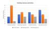
IELTS Bar Chart: Holiday Leisure Activities
The illustration given provides information about the usual number of hours every single day that Chinese, American, Turkish and Brazilian tourists spent …
IELTS Line Graph: Tourist Information Enquiries
The line graph illustrates the number of enquiries made in person, by letter or email and by telephone at a Tourist Information Office in the first half …
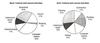
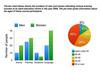
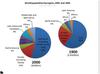
IELTS Pie Chart: Boys and Girls Cultural and Leisure Activities
The pie chart shows the information about how boys and girls spend their time in cultural and leisure activities.
Overall you can see that both boys …
IELTS Line Graph: Recycling Different Materials
The line graph illustrates the recycling rate for some selected materials, i.e. papers and cardboard, glass containers, aluminium cans and plastics between …
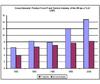
IELTS Bar Chart: GDP of the UK
The bar graph illustrates the components of GDP between IT industry and Service industry in UK from 1992 to 2000 measures in percentage.
Overall, …
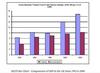
IELTS Bar Chart: Components of GDP
The indicated graphic representation illustrate the factors of Gross domestic product from IT and Service industry of UK in five periods of time as percentage. …
IELTS Bar and Pie Chart: Classes at an Adult Learning Centre
The bar chart illustrates how many males and females attended different classes at an adult learning center in 2009, while the pie chart shows how old …
IELTS Line Graph: 4 Types of Bread
The chart below shows the price in euros of 800 grams of four types of bread in one European country from 2001 to 2006.
The line graph displays the …
IELTS Bar Chart: Internet Usage
The given bar graph illustrates the ratio of people of various age categories in the UK being reported to use internet between 2003 to 2006.
It is crystal …
IELTS Diagram: Differences in Temperature Zones
Hi!
I am Mita. Would you kindly check my writing and give me your opinion?
Thank you
This diagram shows the temperature differences between tropical …
IELTS Bar Chart: Modes of Transport in a European City
The given bar graph presents the percentage of total travellers, who used various types of transportation such as bus, car, bike and walking to travel …
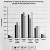
IELTS Bar Chart: Eating of Fast Food in USA
The bar chart demonstrates how often of respondents ate in fast food restaurants in the America from 2003 to 2013.
Overall, the highest among of respondents …
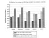
IELTS Bar Chart: Coffee and Tea Buying in Australia
The bar graph Compares residents of five cities in Australia according to their tea and Coffee drinking habits over a 4-week period.
Overall, the percentage …
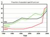
IELTS Line Graph: Proportion of Elderly Population
The line graph illustrates the proportion of the population aged 65 and above in three different countries (USA, Sweden, and Japan) between a century (1940-2040). …
IELTS Line Graph: Domestic Technology Access
The grapg provided illustrates how the figures of domestic acces changed to modern technology in homes around the UK.
It is clearly seen that the CD …
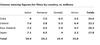
IELTS Table: Activities of Unemployed
The table illustrates the rate of time spent by unemployed males and females in the United Kingdom during the previous year.
Overall, it is clear that …
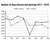
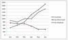
IELTS Line Graph - Shop Closures
The graph illustrates the data of one country between the year 2011 and 2018, the amount of shops that closed and the number of new shops that opened. …
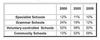
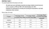
IELTS Table - School Attendance
The table compares the percentage of four types of secondary school students from 2000 to 2009.
Overall, there was a decrease in the proportion of …
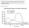
IELTS Line Graph - Radio and TV Audiences
The line graph illustrates the proportion of people listening to radio and watching television in an entire day in the United Kingdom during the months …
IELTS Bar chart - percentage of people who ate five portions of fruits and vegetables
The graph illustrates the share of the UK population who ate fruit and vegetable five times per day between 2001 and 2008. Overall, there was an uptrend …

IELTS Pie Chart - Energy Usage and Greenhouse Gas Emissions in Australia
The juxtaposed pie charts elaborate on the data regarding energy is used in an average and the greenhouse gas emmissions in Australian household.
Overall, …
IELTS Line Graph - Popularity of Three Subjects
The graph provides information about the popularity of three subjects, Medicine, Humanities, and Science between the years 1960 and 2020 at a local university. …
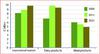
IELTS Bar Chart - Team Scores
The bar chart illustrates the scores of three different teams over four seasons, from 2002 to 2005. Overall, it can be seen that Team B had the highest …
IELTS Line and Bar Chart - UK Visits
The line graph delineates the number of visits into and out of the UK in millions over a 20-year period from 1979 to 1999 while the bar graph illustrates …
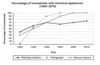
IELTS Line Graph - Electrical Appliances and Housework
The line chart depicts the percentages of households that use appliances with electricity over a 100-year period from 1920 to 2019 and the other line chart …
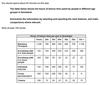
IELTS Table - Spending on Different Items
The table below illustrates the consumption on several goods in Ireland, Italy, Spain, Sweden, and turkey in 2002. The numbers are expressed in percentage. …
IELTS Bar Chart - Global Sales of Digital Games
The bar graph illustrates the world wide sales of four various kinds of computerized games from the year 2000 to 2006.
Overall,it can be visible that …
IELTS Pie Chart - Meals Consumed in USA
Please give a feedback for this task 1 writing
The pie charts illustrate the amount of sodium, saturated fat, and added sugar an average person in …
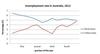
IELTS Line Graph - Unemployment Rate in Australia
The chart illustrates the unemployment situation in Australia by the 2012.
Overall, at the first quarter of the year the rural and urban areas was …
IELTS Bar Chart - Distribution Income Groups Australia
The bar graph compares the percentage of population belonging to various income groups in cities and regional centres in Australia. It classifies the income …
IELTS Line Graph: GDP Growth Rate
The line graph compares the GDP growth rate in Vietnam and South Korea between 1986 and 2018. It is measured in percentages. Overall, it can be seen that …
Domestic Access to Modern Technology
The line graph presents the percentage of the use of modern technological equipment in British households from 1996 to 2003.
Overall, it can be seen clearly …
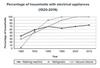
IELTS Line Graph - Electrical Appliances and Housework
The charts show the changes in ownership of electrical appliances and amount of time spent doing housework in households in one country between 1920 and …
IELTS Bar Chart - Industry Sectors and GDP in India
The bar graph illustrates the percentage contributions made by Agriculture, Industry, and Service sectors to India's GDP between 1960-2000.
Over the …
IELTS Bar Chart Emigration
The bar chart illustrates the statistics concerning the number of emigrants from Britain to certain different countries between the years 2004 and 2007. …
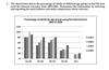
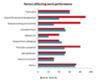
IELTS Bar Chart: Illiteracy Rates
The bar chart compares the percentages of illiteracy of men and women in 6 different areas.The data is from last year.
On the whole, illiteracy rates …
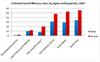
IELTS Pie Chart - Purchasing and Consuming Coffee and Tea
The given chart compares Australian residents’ habits in purchasing and consuming coffee and tea in five major cities in the past four weeks.
Overall, …
IELTS Line Graph - Student Enrolment
The graphs show the enrolments of overseas students and local students in Australian universities over a ten year period.
The graph illustrates the …
IELTS Line Graph - Tourists Visiting Caribbean Island
Hi everybody, what do you think about the task 1 answer below? How would you rate it if you were the examiner and what are the points that I must improve. …
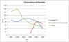
IELTS Line Graph - Recycling Rate
The graph below shows the proportion of four different material that was recycled from 1982 to 2010.
Overall, a higher percentage in paper and cardboard …
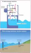
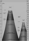
IELTS Process - Wave Energy Machine
The diagrams illustrate the interior design of a wave-energy machine along with the possible locations to install the machine.
The wave first travels …
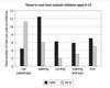
IELTS Bar Chart - School Trips
This bar graph illustrates the number of trips to and from school per year, by children employing various transportation means in one specific geographical …
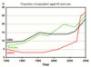
Percentage of People Aged 65 and Above
The graph shows the percentage of people aged 65 and above, in three countries, over the span of a 10 years. It can be inferred from the graph that though …
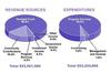
IELTS Pie Charts - Revenues
Revenue Sources and Expenditures of a USA Charity in one year, 2016.
The pie chart demonstrates the revenue sources the USA Charity was allocating and …
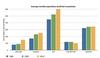
Bar Chart - Average Monthly Expenditure
The bar chart illustrates the average monthly expenses of a UK household for utility bills, transport, rent, entertainment and groceries, in three years …
Pie Charts Souces of Energy
The pie charts show the energy production from 5 major sources (oil, natural gas, coal, hydroelectric power and nuclear power) for the USA in 2 years (1980 …
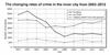
IELTS Line Graph: Changing Rates of Crime
The graph examines the rate of crimial activity in Newport city during different years, from 2003 to 2012. The crimes that are compared are burglary, car …
IELTS Line Graph - Population of Turtles in India
A glance at the line graph provided reveals the population figures for various types of turtles in India over 32-year period between 1980 to 2012.
As …
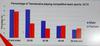
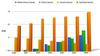
IELTS Bar Chart - Tasmanians Playing Team Sports
The given bar chart depicts the percentage of women and men of Tasmania who participated in competitive sports in different categories based on age in …
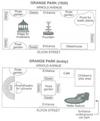
IELTS Task 1 Plan
The plans show the changes have been made around the Grange Park between 1920 and today.
Overall, it is clear that there have been several changes, …
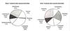
IELTS Pie Chart - Survey of Children's Activities
The two pie charts presents a conclusion of "leisure" and "cultural" activities as preferred by boys and girls.
Overall, equal percentage of boys and …
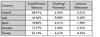
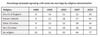
IELTS Table - Number of Mobile Phones Sold
The provided table illustrates the amount of mobile phones, measured in millions, from five different brands are sold over a period of six years. Overall, …
IELTS Line Graph - CO2 Emissions
The given chart illustrate how the amount of CO2 discharged by individuals in 4 seperate countries differ in a 40-year period from 1967 to 2007. All the …
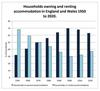
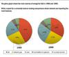
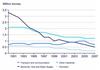
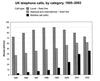
IELTS Bar Chart - Households in Owned and Rented Accommodation
The bar graph shows the percentage of households owned and rented accommodation in England and Wales between 1918 and 2010.
In England, people are gradually …
IELTS Line Graph - Full and Part-Time Study
The bar chart illustrates the number of males and felmales in Britain studying part time and full time over the period 1970/71’ 1980/81 and 1990/91.
…
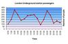
IELTS Line Graph - London Underground Travel
The line graph shows how many people in London travel by Underground train in each different time of day from 6 am to 10 pm.
Overall, it is clear that …
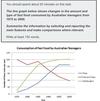
Fast Food Consumption in Australia
The line graph gives information about, the variation of consumption of three type of fast food among adults in Australia during the period 1975 to 2000.Overall …
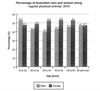
IELTS Bar Chart - Physical Activity
Hello, everyone. What are your thoughts on this answer? Where can I find model answers for bar charts that have various ages as categories. Thanks for …
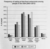
IELTS Bar Chart - USA Fast Food Consumption
Hi, everyone. I would be extremely happy to receive some feedback on my recent work.
If you have any suggestions on how to improve my report, I would …
IELTS Bar Chart - Travellers using three major airports
Please tell me my band and mistake I did and how to improve band score.
***
Depicted here is a chart which delineates about the number of travelers …
IELTS Table Consumer Spending
The table shows data about spending money by the people of five European countries in 2002. The statistics are organized in three different types of expenditures: …
IELTS Line Graph - Acid Rain Emissions
Hi guys, I need your help with my Task 1. Thank you very much.
The line graph compares four distinct fields from which the amount of acid rain pounding …
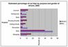
IELTS Pie Chart - Reasons for Immigration
According to the chart, we see the different causes that drove people to leave or come to the UK in 2007, it’s also obvious that employment was one of …
IELTS Line Graph - Consumption of Spreads
The line graph shows the consumption of spreads in grams between 1981 and 2007. Overall, it can be seen that the consumption of low fat and reduced spreads …
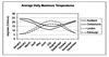
IELTS Line Graph Daily Temperatures
Hi buddies!
Could you please help me and check the writing task 1 below?
***
The line graph illustrates what average daily maximum temperatures …
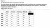
IELTS Table - Same Sex Marriage
I'd like to know which version of the below question is the best and any tips: Struggling to know which way is best to write tables
The table shows …
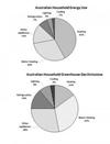
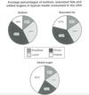
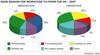
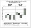
IELTS Pie Chart - Australian Household Energy Use
The two charts represent the use of energy by an average Australian household and emission of greenhouse gas from the use of energy respectively. Heating …
IELTS Bar Chart - Southland's Exports
This bar chart gives an overview on Southland's main exports in different fields. It shows data about 2000 and 2018 and also makes projections for 2025. …
IELTS Table - Leisure Time
Hi there,
I'm planning to retake the test. Please review this essay for me. I really appreciate it.
The table presents statistical data on the changes …
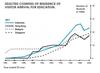
IELTS Line Graph - Overseas Students in Australia
The graph below shows four countries of residence of overseas students in Australia.
The line chart gives information about the number of students …
IELTS Bar Chart - Rentals and Sales of Films
The bar chart illustrates how the value of rentals and sales of movies have changed whithin a specific store between 2002 and 2011. Overall, rentals number …
IELTS Bar Chart - UK Residents' Visits Abroad
Hello again,
Please help me with my latest essay. Thank you so much.
***
The first table concentrates data from 100,000 participants about …
Bar Chart Money Spend on Consumer Goods
Hi again,
Please also help me with my task 1 writing. Thank you very much.
The chart gives the information about consumption of six goods in four …
IELTS Table - Land Covered by Forest
Hello again,
I also have Task 1 essay. Please review it for me, please.
Thank you.
The table illustrates the forest rates as percentages in …
IELTS Bar Chart - Car Trips
The provided bar chart depicts the estimated percentage of car trips taken between male and female in 2005 from eight different purposes. Most noticeably …
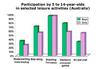
IELTS Bar Chart - Leisure Activity Participation
The bar chart shows the participation of children in selected leisure activities in Australia.
Summarize the information by selecting and reporting …
IELTS Graph CO2 and Vehicles
The figures compare a lot of CO2 that emitted annually by cars, buses, vans and trucks, and illustrate data on the number of vehicles in England and Wales …
Bar Chart Museum Visits
As is shown by the graph how many guests to the three museums in the period from 2000 to 2005.
First of all, let us take a look at the date provided …

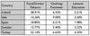
IELTS Table - Computer and Internet Users
I am pleased to connect with you, we'll help each other improve our Ielts skills. This is my recent task needed your comments.
***

The table …
IELTS Line Graph - Dubai Gold Sales
The line graph gives information about gold trade in Dubai from January to December of the year 2002.
It is clear in the graph that the gold sales reached …

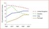
IELTS Line Graph - Proportion of Population Over 65
Hello everyone, please check out my essay. Friends check the coherence and cohesion, structure of the essay. Thanks a lot.
***
The bar chart shows …
IELTS Bar Chart - Percentage of Urban Populations
Hi,
I have been studying for the IELTS for over a year now, and my reading and listening is acceptable (estimated to be 8.0+), but my writing has …
IELTS Table - Underground Railway System
Hello,
My name is Wahyu and I want to improve my English writing skills.
Can anyone help me to correct, comment, or review my writing?
This …
IELTS Bar Chart - Software Downloads
Can you guys please help me to find something wrong with them? I have written this graph twice and also within 15 mins.
Description One
The …
IELTS Bar Chart - Annual GDP Growth
The bar graph shows how levels of annual GDP growth for Tunisia, Ecuador and Japan have altered from 2007 to 2010.
More specifically, in 2007, Tunisia’s …
IELTS Bar Chart - Number of Car Journeys to the City Centre
The chart elucidates the number of journeys with car into the city center by residents and non-residents over ten years period. The x-axis shows the years …
IELTS Bar Chart - Science Qualifications
The bar chart illustrates the percentage of science qualifications in Malaysia and Singapore. On the x-axis there are 4 types of qualifications in science, …
IELTS Line Graph - Fast Food Consumption
The bar graph represents the weekly expenditure on three categories of fast food according to income groups in britain while the line graph illustrates …
IELTS Bar Chart - UK Telephone Calls
The bar chart depicts the total no. Of million minutes utilized for different phone call types categorised as local, national & international and mobile …
IELTS Bar Chart - Changes in Average House Prices
The bar chart below illustrated the changes of the price in overall accommodation prices in five different cities in two time periods: 1990 to 1995, 1996 …
IELTS Bar Chart - Honey-Bee Colonies and Production
The charts gave information about the number of honey-bee colonies and the amount of honey production in the United States between 1970 and 2010.
The …
IELTS Line Graph - Radio and Television Audiences
This line graph shows the percentage of audiences in UK who entertain TV and radio through the day from October – December in 1992.
Generally, the …
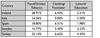
IELTS Table - Consumer Spending on Different Items
Hi,
I really need a band 7. Can you please tell me if its good enough for me to sit the exam. I will really appreciate your answer :)
***
…
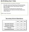
IELTS Table - Secondary School Attendance
The table indicates the percentage of students who attended four different secondary schools in the years of 2000, 2005 and 2009.
As seen in the table, …
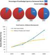
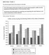
IELTS Pie and Line Graph - Spending on Restaurant Meals
hello guys,
could you help me to grade my IELTS task 1 writing?
I appreciate your help.
The pie charts illustrated food budget ratio between dining …
IELTS Table - Pupils who entered higher education
Hi! Could you help me to improve my writing skills?
The table below shows the percentage of pupils who entered higher education from five secondary …
IELTS Bar and Line Graph - Three companies selling farming equipment
Hi! Could anyone grade my graph?
The graph shows the value in thousands of dollars of three companies selling farming equipment every five years …
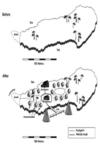
IELTS Maps
can someone please check my task 1 and rate it.
The two maps show the same island. The first one is before and the second one is after the construction …
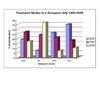
IELTS Bar Chart - Modes of Transport
The bar chart illustrates the different types of transports used to travel in a European City from 1960 to 2000. It is evident from the chart that, car …
Line Graph - Average weekly earnings of graduates and non-graduates
please check bellow task
The graphs provide the comparison of weekly income in average, for both genders, who have academic degree and non-academic …
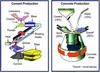
IELTS Process Diagram Examples
These diagrams illustrate the process of making cement first, followed by a visual explanation of concrete’s production. While cement is made through a …
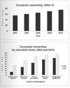
IELTS Bar Chart - Computer Ownership
Hi, may i please have a feedback on my ielts writing below? any suggestion is a huge help. thank you.
Computer ownership increases significantly from …
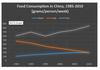
IELTS Line Graph - Food Consumption in China
can i get a band 8 for my graph?
The line graph compares the amount of food eaten by Chinese consumers from 1985 to 2010.
Overall, it can be seen …
IELTS Graphs - Global Population Trends
Can anyone check my graph essay?
The pie charts compare the change of global population between 1990 and 2000.
It is clear that there was a significant …
Task 1: Cinema Viewing Figures For Films
Can someone check this....Please give me my possible band score...tnx
The table chart elucidates information on the cinema viewers for films by the …
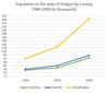
IELTS Line Graph - Population in the US State of Oregon
It'd be nice of you if you help me and correct my mistakes to avoid making any in my IELTS exam. thank you so much.
The line graph compares the change …
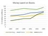
IELTS Line Graph - Money Spent on Books
The line graph elucidates information on the money spent on buying books in the four various countries-Germany, France, Italy and Austria-for 10 years …
IELTS Line Graph - The changing patterns of domestic access to technology
The graph illustrates the changes in domestic access to modern technology in the UK from 1996 and 7 years later.
It is apparent from the charts, domestic …
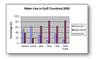
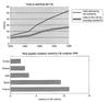
IELTS Task 1 - Use of Water among Gulf Countries
The graph compares domestic, agriculture and industrial use of water among gulf countries, in the year of 2000. It can be seen that Oman and Saudi Arabic …
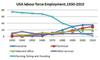
IELTS Line Graph - Employment Patterns in the USA
Hello everyone!
I have to say that: this has been the first time i try writing an IELTS writing task 1. I am sure that I have made a lot of mistake. …
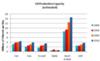
IELTS Bar Chart - Oil Production Capacity
The graph compares changes in the Oil Production Capacity in millions of barrels per day in six countries.
Overall, it is clear that oil production …
IELTS Line Graph - Visits to New Music Websites
The line graph delineates information in comparison to the number of visits to two new music sites on the web.
On day 1, one can favourably notice that …
IELTS Bar and Pie Chart - Reasons for Study
The first graph shows that there is a gradual decrease in study for career reasons with age. Nearly 80% of students under 26 years, study for their career. …
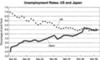
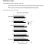
IELTS Line Graph - Unemployment in US and Japan
The line graph compares figures for unemployment in America ad Japan over a period of six years.
Overall, the unemplyment rate was higher in Japan,compared …
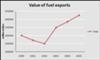
IELTS Line Graph Value of Exports
The graph below shows the total value of exports and the value of fuel, food and manufactured goods exported by one country from 2000 to 2005.
Summarize …
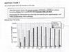
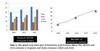
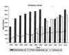
Task 1 Bar Chart: Effectiveness at Work
The graph illustrates the information about the factors that affect the work effective of workers in a company. Workers are divided into two groups depending …
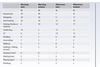
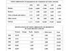
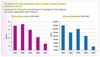
Task 1 Table: IELTS Results
The graph illustrates the ielts results of candidates from some language groups during 2003. As can be seen from the graph, all numbers ranged from 6 to …
Comments
Any comments or questions about this page or about IELTS? Post them here. Your email will not be published or shared.

Band 7+ eBooks
"I think these eBooks are FANTASTIC!!! I know that's not academic language, but it's the truth!"
Linda, from Italy, Scored Band 7.5


Bargain eBook Deal!
30% Discount


All 4 Writing eBooks for just $25.86
Find out more >>
IELTS Modules:
Other Resources:


Recent Articles
-
Free IELTS Essay Checker: Instant and No Login Required
Mar 26, 26 08:30 AM
Free IELTS essay checker giving you an instant overall band score, detailed scores for all IELTS writing criteria, example errors, and clear suggestions to improve your Task 2 essay. -
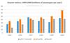
IELTS Bar Chart: Average Number of Coastal Flood Events per Year
Mar 10, 26 05:34 AM
 The chart below shows the number of flood events in four different cities in the United States during four different periods. The bar graph depicts the
 -
Should Everyone Learn English
Mar 10, 26 05:32 AM
I would be pleased if someone could provide feedback. I want to know if my essay well-structured and the exact band. Learning English at school is often

Important pages
IELTS Writing
IELTS Speaking
IELTS Listening
IELTS Reading
All Lessons
Vocabulary
Academic Task 1
Academic Task 2
Practice Tests
Connect with us

Before you go...
30% Discount - Just $25.86 for all 4 Writing eBooks

Copyright © IELTSbuddy All Rights Reserved
IELTS is a registered trademark of University of Cambridge, the British Council, and IDP Education Australia. This site and its owners are not affiliated, approved or endorsed by the University of Cambridge ESOL, the British Council, and IDP Education Australia.