- Home
- Task 1 Lessons & Tips
- Graph Over Time
IELTS Task 1 Graph Over Time
This lesson explains how to describe a line graph or bar chart for IELTS task 1 that is over time. This uses an example of a bar chart, but it will be the same for a line graph.
You can watch a video of this
lesson instead if you'd like:
Types of Language Needed
When you get a chart or graph to describe, it is always important to check whether there is a time frame or not. If there is, you will need to use the language of change (e.g. increased; decreased).
However, it is not enough just to describe the changes of each element (ActiveX, Java and Net in this case) on their own and ignore how they relate to each other.
Look at the question. It says:
- Summarise the information by selecting and reporting the main features and make comparisons where relevant.
You are asked to compare the data as well. So you must also compare the elements where relevant in your IELTS task 1 (e.g most popular; lower; the least).
Organisation
You must also group data together to make sure you have a well organized and coherent answer. To do this, you need to look for similarities and differences when you first analyze the graph for IELTS task 1, and decide what can be logically put together or not.
Sample Graph and Answer
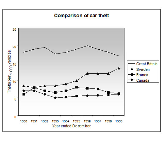
Now look at the bar chart below and read the IELTS task 1 model answer.
You should spend about 20 minutes on this task.
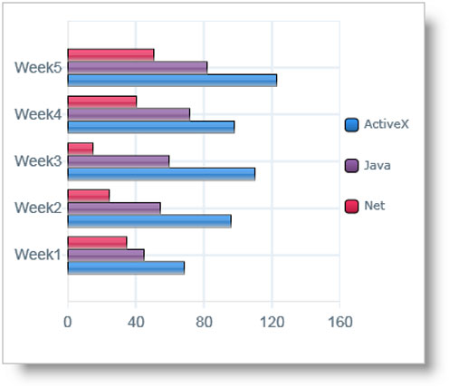
The bar chart shows the number of times per week (in 1000s), over five weeks, that three computer packages were downloaded from the internet.
Summarise the information by selecting and reporting the main features and make comparisons where relevant.
Write at least 150 words.
Model Answer
The bar chart illustrates the download rate per week of ActiveX, Java and Net computer packages over a period of five weeks. It can clearly be seen that ActiveX was the most popular computer package to download, whilst Net was the least popular of the three.
To begin, downloads of ActiveX and Java showed similar patterns, with both gradually increasing from week 1 to week 5. However, the purchases of Active X remained significantly higher than that of the other product over this time frame. In week 1, purchases of ActiveX stood at around 75,000, while those of Java were about 30,000 lower. With the exception of a slight fall in week 4, downloading of ActiveX kept increasing until it reached a peak in the final week of just over 120,000. Java downloads also increased at a steady rate, finishing the period at 80,000.
The product that was downloaded the least was Net. This began at slightly under 40,000, and, in contrast to the other two products, fell over the next two weeks to reach a low of approximately 25,000. It then increased sharply over the following two weeks to finish at about 50,000, which was well below that of ActiveX.
(Words 198)
Examples of Language of Change
As you can see, there are several examples of this in the graph, so it is important to learn how to use these correctly in order to successfully write an IELTS task 1 chart over time. Here are some examples:
- gradually increasing
- a slight fall
- kept rising
- reached a peak
- increased at a steady rate
- fell
- increased sharply
- a low of
- finish at
- stood at
- finishing the period at
You will need to practice this type of language, and also make sure you know a variety of structures to get a better score – if you keep repeating the same kind of phrases this will show you have a more limited range of lexis and grammar.
Examples of Comparisons
In IELTS task 1, you must also compare the data as you are asked to do in the rubric.
If you just write about what happened to ActiveX, what happened to Java, and what happened to Net, without showing any relationship between them, this won’t be enough.
Here are some examples of where comparisons are made between the products in the IELTS task 1 graph, and the language of comparison is highlighted in bold / red:
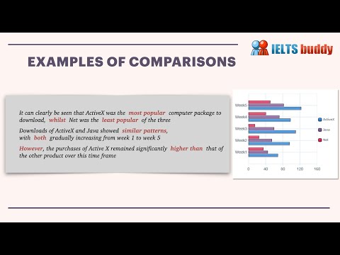
It can clearly be seen that ActiveX was the most popular computer package to download, whilst Net was the least popular of the three
Downloads of ActiveX and Java showed similar patterns, with both gradually increasing from week 1 to week 5
However, the purchases of Active X remained significantly higher than that of the other product over this time frame
In week 1, purchases of ActiveX stood at around 75,000, while those of Java were about 30,000 lower
Java downloads also increased at a steady rate, finishing the period at 80,000
The product that was downloaded the least was Net. This began at slightly under 40,000, and, in contrast to the other two products, fell over the next two weeks
It then increased sharply over the following two weeks to finish at about 50,000, which was well below that of ActiveX
Grouping the Data
It is a good idea to divide your answer into paragraphs so it is well organized. To do this, you should group similar things together into paragraphs or sections.
If you look at the chart, you will see that ActiveX and Java have a similar pattern, both steadily increasing over the period (apart from the slight fall of ActiveX in week 4), so these could be put together.
Body Paragraph One:
To begin, downloads of ActiveX and Java showed a similar trend, with both gradually increasing from week 1 to week 5. However, the purchases of Active X remained significantly higher than that of the other product over this time frame. In week 1, purchases of ActiveX stood at around 75,000, while those of Java were about 30,000 lower. With the exception of a slight fall in week 4, downloading of ActiveX kept rising until it reached a peak in the final week of just over 120,000. Java downloads also increased at a steady rate, finishing the period at 80,000.
On the other hand, Net is the lowest and it has a different pattern – falling and then rising again. So this could be described in another paragraph.
Body Paragraph Two:
The product that was downloaded the least was Net. This began at slightly under 40,000, and, in contrast to the other two products, fell over the next two weeks to a low of approximately 25,000. It then increased sharply over the following two weeks to finish at about 50,000, which was well below that of ActiveX.
There is usually more than one way to group the data for an IELTS task 1, so this needs to be your decision. As long as it is logical and makes your answer easy to follow and read, this should be ok.
More Task 1 Academic Lessons:
IELTS Task 1 Line Graph Structure Using Groups
For an IELTS Task 1 Line Graph there are different ways to organise your answer. Grouping information is a good way to get a logically structured response.
Describing IELTS Graphs: Tips to avoid a common mistake
IELTS Graphs: A common mistake In IELTS graphs is to get the subject of the graph wrong. This lesson explains how this mistake is made and show you what you need to do to avoid it. There is a also a practice exercise.
Tips for Organising an IELTS Line Graph
Organising an IELTS Line Graph - This lesson shows you have to improve the coherency of your graph in order to achieve a high band score.
IELTS Bar and Line Graph: How to describe two graphs together
This Bar and Line Graph example shows you how you can write about two charts together in the IELTS test for task 1, with strategies and techniques.
Learn Compare and Contrast Language for IELTS Graphs
Compare and Contrast Language: In the academic IELTS task 1, you have to know the right language if you want to get a band 7 or higher. Practice your IELTS language for bar charts in this task 1 writing lesson.
Which Tenses for IELTS are the Most Important?
Candidates often ask which tenses for IELTS are needed in order to do well in the exam. This lesson goes through the grammar tenses and how they apply to the test.


Comments
Any comments or questions about this page or about IELTS? Post them here. Your email will not be published or shared.
Before you go...
Check out the IELTS buddy
Band 7+ eBooks & Courses
Band 7+ eBooks
"I think these eBooks are FANTASTIC!!! I know that's not academic language, but it's the truth!"
Linda, from Italy, Scored Band 7.5


IELTS Modules:
Other Resources:


Recent Articles
-
Fillers for IELTS Speaking: Avoid 'Eh', Uhm', 'You know'.
Apr 27, 24 05:48 AM
fillers for ielts speaking -
Decreasing House Sizes Essay
Apr 06, 24 10:22 AM
 In this decreasing house sizes essay for IELTS you have to discuss the pros and cons of smaller house sizes and gardens.
 -
Latest IELTS Writing Topics - Recent Exam Questions
Apr 04, 24 02:36 AM
 See the latest IELTS writing topics from the exam which have been posted by candidates who've taken the test.


%2C%20over%20five%20weeks%2C%20that%20three%20computer%20packages%20were%20downloaded%20from%20the%20internet.%0A%0ASummarize%20the%20information%20by%20selecting%20and%20reporting%20the%20main%20features%20and%20make%20comparisons%20where%20relevant.)

Copyright © IELTSbuddy All Rights Reserved
IELTS is a registered trademark of University of Cambridge, the British Council, and IDP Education Australia. This site and its owners are not affiliated, approved or endorsed by the University of Cambridge ESOL, the British Council, and IDP Education Australia.