- Home
- Task 1 Lessons & Tips
- Ielts Table
IELTS Tables Explained
Describing an IELTS table is similar to describing charts or graphs. The same structures of comparison and contrast are used or language of change if the table is over time.
A table is just another way to present information.
You can also watch a video of this lesson:

It does not require that you learn a new type of language or a new way to organize things.
For example, take a look at this IELTS table showing the quality of life in four countries presented in a table:
Country |
GNP per head (1982: US dollars) |
Daily calorie supply per head |
Life expectancy at birth (years) |
Infant mortality (per 1000 live births |
Bangladesh |
140 |
1877 |
40 |
132 |
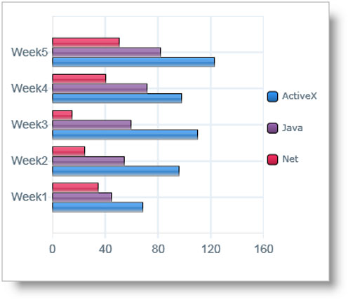
If we wanted, we could present this same information as a bar chart:

However, as you'll notice, it is better presented as a table because of the huge difference between the USA and the others - this is not very clear on a bar chart.
So a table looks better, but they would both be described in exactly the same way.
Analysing the IELTS Table
As with all graphs and charts, when describing tables:
- Do not describe all the data presented - present the main points of each feature (you should make sure you mention each feature though, e.g. if there are 5 countries, mention every one)
- Look for significant data; e.g. the highest, the lowest etc
- Try and group the data. This may require you to use some general knowledge about the world, such as recognising developed and developing countries
Practice
Look at the IELTS table that you looked at above and answer the questions that follow:
You should spend about 20 minutes on this task.
The following table gives statistics showing the aspects of quality of life in five countries.
Summarise the information by selecting and reporting the main features and make comparisons where relevant.
Write at least 150 words.
Table: The Quality of Life in Five Countries
Country |
GNP per head (1982: US dollars) |
Daily calorie supply per head |
Life expectancy at birth (years) |
Infant mortality (per 1000 live births |
Bangladesh |
140 |
1877 |
40 |
132 |
- What is the table measuring?
- What type of language do you need to use (Change? Comparing and contrasing?)
- What tense would you use?
- Which country has the best quality of life and which has the worst?
- What information could you use for an overview / conclusion?
- How could you group the information?
- How many paragraphs would you have and what would you write about in each one?
Making a Plan
You should always ask yourself these kind of questions before you write your task one. You can then use the answer to these questions to make yourself a quick plan.
Here are some notes made by a student during the planning stage:
PLAN
Topic – standard of living, 5 countries
Language – comparison
Time / tense – 1982 = past
Overview – USA far higher
Groups –
USA = highest
Egypt, Indo, Bol = similar
Bangladesh = very low
Now, take a look at this IELTS table model answer and notice how the organization matches the plan. The groups chosen that are similar are grouped together into paragraphs.
The language is focused on the language of comparison and contrast as the table is not over time. The compare and contrast structures have been highlighted so you can see how they are used.
Is it similar to the way you would have organized the information?
Model Answer
Country |
GNP per head (1982: US dollars) |
Daily calorie supply per head |
Life expectancy at birth (years) |
Infant mortality (per 1000 live births |
Bangladesh |
140 |
1877 |
40 |
132 |
The table uses four economic indicators to show the standard of living in five selected countries in 1982. Overall, it can be seen that the quality of life in the USA was far higher than the other four countries.
To begin, the USA, which is a developed country, had the highest GNP at 13,160 dollars per head. It also had a much higher daily calorie intake and life expectancy, and the lowest rate of infant mortality, at only 12 per 1000 live births.
Quality of life was much lower for the other four countries. The indicators for Egypt, Indonesia and Bolivia were fairly similar, with their GNP ranging from 570 to 690 and daily calories in the 2000s. Life expectancy was also almost the same, although Bolivia had much worse infant mortality at 124 per 1000.
Bangladesh had by far the lowest quality of life in all the indicators. Its GNP per head was approximately one percent of the USA’s. Its calorie intake and life expectancy were about half those of the USA, and its infant mortality rate was 11 times greater.
More Task 1 Academic Lessons:
Writing Tips for a Graph in the Future in IELTS Academic
Graph in the future: Sometimes graphs in IELTS refer to a future time. You must know the language to write about these. In this lesson, learn how to write about an IELTS graph in the future. Getting the tenses right is an important part of the IELTS writing task 1.
How to Describe an IELTS Academic Writing Task 1 Graph
IELTS Academic Writing Task 1: This lesson describes in a simple way how you should describe a graph for the academic part of the test for task 1. You need an introduction, overview and body paragraphs. These simple steps will show you how, and how to get a high score.
IELTS Bar and Line Graph: How to describe two graphs together
This Bar and Line Graph example shows you how you can write about two charts together in the IELTS test for task 1, with strategies and techniques.
Take an IELTS Quiz to test your IELTS knowledge
IELTS Quizzes to test and train you on the writing task and task 2 of the IELTS test. Gap fills and multiple choice.
Prepositions in Graphs Quiz: Between; from; to; at; of; in; with; by
Prepositions in Graphs: Practice using prepositions in the IELTS test. View a model answer and practice using a gap fill.
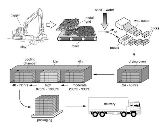
IELTS Process Diagram Strategies and Tips
IELTS Process Diagram: In task 1 of IELTS writing you usually have to describe some kind of graph or chart. But sometimes you get a process. It is therefore crucial that you know how to do this. This easy to follow lesson explains how.


Comments
Any comments or questions about this page or about IELTS? Post them here. Your email will not be published or shared.
Before you go...
Check out the IELTS buddy
Band 7+ eBooks & Courses
Band 7+ eBooks
"I think these eBooks are FANTASTIC!!! I know that's not academic language, but it's the truth!"
Linda, from Italy, Scored Band 7.5


IELTS Modules:
Other Resources:


Recent Articles
-
Decreasing House Sizes Essay
Apr 06, 24 10:22 AM
 In this decreasing house sizes essay for IELTS you have to discuss the pros and cons of smaller house sizes and gardens.
 -
Latest IELTS Writing Topics - Recent Exam Questions
Apr 04, 24 02:36 AM
 See the latest IELTS writing topics from the exam which have been posted by candidates who've taken the test.
 -
IELTS Essay: English as a Global Language
Apr 03, 24 03:49 PM
 Evaluate my writing task for academic ielts, pls Academic IELTS writing task 1 --------------------------------------------------------------------------------------------------------------


Copyright © IELTSbuddy All Rights Reserved
IELTS is a registered trademark of University of Cambridge, the British Council, and IDP Education Australia. This site and its owners are not affiliated, approved or endorsed by the University of Cambridge ESOL, the British Council, and IDP Education Australia.