IELTS Computer Delivered Tests + Band Score

IELTS Bar Chart - Transport used to travel in a European City

by Kazi Afzal Hossain

The bar chart shows the different modes of transport used to travel to and from work in one European city in 1960, 1980 and 2000.

The bar chart shows the different modes of transport used to travel to and from work in one European city in 1960, 1980 and 2000.

The bar chart illustrates the different types of transports used to travel in a European City from 1960 to 2000. It is evident from the chart that, car transport was gradually increasing throughout the period, while the other transports were declined.

To begin, car traveler stood at just 5 per cent in 1960, which was 5 times less than for the bike traveler, and this was far less than on foot. Apart from a jump to approximately 35% of total travelers in 2000.

The next two transports popularity were the similar trend, both were gradually decreasing over the time frame. In 1980, bike and foot travelers were 20% and at about 18% respectively. At the end of the period, both transports were in between 5 to 8% in 2000.

Bus popularity spiked to 25 per cent in 1980. Then its popularity decreased the following year, and the bus traveler was 15 per cent.

Please give me feedback on my graph

Comments for IELTS Bar Chart - Transport used to travel in a European City

Click here to add your own comments

Sep 23, 2020
Thanks
by: Anonymous

it helped me a lot in school exam. lol!!!

Click here to add your own comments

Join in and write your own page! It's easy to do. How? Simply click here to return to IELTS Graph Feedback Forum.


Task 1 Bar Graph Over Time:
Modes of Transport

by DRAVID
(THAILAND )

The graph shows the different modes of transport used to travel to and from work in one European city in 1960, 1980 and 2000.

The graph shows the different modes of transport used to travel to and from work in one European city in 1960, 1980 and 2000.


The bar graph changes in the transports used to and from work in a particular European city for three years.

Overall the chart indicates that car used increased over the period shown, where as use of bus declined. The figures for tubes and trains both fluctuated over the same period of time.

As regard, by far the greatest proportion of commuters used bus, at nearly 40%. The figures for other means of transports- tube, car and train- were at around 27%, 22% and 19% respectively.

Between 1960 and 2000, commuters using bus fell in popularity as the figure fell to about 26% in 1980 and this fell even further to 15% in 2000. In contrast, use of car increased significantly to about 23% in 1980, before pushing the figure to well above 35% towards the end of the period. To move to train, the figures increased to about 26%, but this fell to just over 20% by 2000. Use of tube declined in 1980, in terms of tube, there was marked downward trend in 1980, before rising to a quarter in the final year.

==================================================

IELTS buddy
Feedback

Corrected Version:


The bar graph illustrates changes in the transport used to and from work in a particular European city for three years.

Overall the chart indicates that car used use increased over the period shown, where as whereas the use of the bus declined. The figures for tubes and trains both fluctuated over the same period of time.

As regard, Regarding 1960, by far the greatest proportion of commuters used buses, at nearly 40%. The figures for other means of transport- tube, car and train- were at around approximately 27%, 22% and 19% respectively.

Between 1960 and 2000, commuters using bus fell in popularity as the figure fell the popularity of the bus with commuters fell to about 26% in 1980 and this fell even further to 15% in 2000. In contrast, the use of cars increased significantly to about 23% in 1980, before pushing the figure rising steeply to well above 35% towards the end of the period. To move to Moving on to the train, the figures increased to about 26%, but this fell to just over 20% by 2000. The use of the tube declined from 1960-1980, in terms of tube, there was marked downward trend in 1980,(you are repeating yourself here) before rising to a quarter 25% in the final year.

==================================================

FURTHER COMMENTS


Overall it is a good answer as you organize your response well, you describe the key features and you make comparisons as well which is important.

You also have some good language in there and use the correct tenses, but as you can see from my corrections, there are still some mistakes you are making with some of your comparison structures and phrasing.

So take note of these and keep practicing. You can view a lesson on writing a graph over time here if you have not already seen it:

Lesson: Writing about a graph over time


Return to Task 1 Student Samples

Comments for Task 1 Bar Graph Over Time:
Modes of Transport

Click here to add your own comments

Mar 04, 2015
comment me - Task 1 Bar Graph Over Time: Modes of Transport
by: andry

The bar chart compares the transportation method used by people in European City to commute to and from work in 1960, 1980, and 2000. As it can clearly be seen, Train and Car have an upward trend during those period, while Tube and Bus have a complete opposite trend.

In 1960, more than one-third of people went to and from work by using Bus. The trend was changed in 1980, when the proportion went down to only 26% and in 2000 the percentage plummeted furthermore to only 15%. The same goes to tube, started at well above 25% in 1960, it then fell down by 5% before finished at 25% mark in 2000.

In the other hand, only around 6% people were using car as their primary transportation in 1960. The popularity of car then increased significantly in the next period, showed by more than 15% rise in 1980. The trend is not stopped there as car finished at 35% in 2000 with another 15% surge. An upward trend also seen in train as it rose more than 10% in 1980 to just below 30% mark, although it slumped to 22% in 2000.

Overall, people used car and train in 2000 more than in 1960. While, Bus was not used as often as the preceding decades.

Jun 14, 2015
Which band-score my essay shall get?
by: Anonymous

The graph gives information about the different methods of transport used by European commuters to and from work during the years of 1960, 1980 and 2000.

According to the data mentioned in the graph, the usage of cars dramatically increased over the years and became the most used mode of transport in 2000s with 37% of total travelers. Adversely, the usage of buses, the most popular transport in 1960s, declined from 38% to 10% in 2000s.

There are no significant fluctuations with the usage of trains and tubes during 40 years period according to the data. The percentage of the commuters using trains in 1960 was 18% with a slight increase in the next two decades to 28% and finally falling back to 22% in 2000.

The tube were however the second most popular means of transport in 1960 and 2000 with 27% and 25 % of overall users respectively.

Aug 20, 2015
Please give reply regarding my response
by: MIKE

MODES OF TRANSPORT

The bar graph shows different modes of transports used by commuters in the year 1960,1980 and 2000.It is clear from the graph car transport had increased enormously from 1960 to 2000.

In the year 1960 nearly 20 percent of commuters had travelled by train whereas it had increased to 28 percent in 1980 and fallen to 22 percent in 2000.The car transport used by commuters in 1960 is only 5 percent whereas it increased to 22 percent in 1980 and further more it rised to 37 percent in 2000.

The other modes of transport used by commuters are tubes and buses.The tubes mode of transport had been fluctuating over years.In the year 1960 nearly 27 percent commuters travelled by tubes whereas it declined to 22 percent in 1980 and inclined to 25 percent in 2000.Regarding bus transport it had been declining continuously from 1960 to 2000.Commuters travelled by bus are decreased from 37 percent to 15 percent.
Overall,car mode of transport used by commuters had been increasing whereas bus mode of transport is declining continuously.

Oct 29, 2015
Please answer my question?
by: Anonymous

Is it necessary to write a title for writing task 1 and 2?

Oct 29, 2015
Please answer my question?
by: IELTS buddy

No you don't need a title.

Jan 10, 2016
Can anyone feedback for this this WT1?
by: Siwan

The bar chart depicts the various types of transportation in an European city that commuters used for traveling to and from workplace in the three years. Overall, according to the statistics revealed that cars showed the upward trends, while buses showed an downward trends and trains and tubes displayed some fluctuations.

As can be seen, in 1960, people who went to work by trains were nearly 20%. Interestingly, the number of travelers by trains increased by approximately 28% in 1980, and for the following year, it decreased gradually at almost 20%. Tubes, on the other hand, it started from about 28% in 1960mand went down to under 25% between 1980 and 2000.

However, buses had more popularity among travelers in 1960, cars began from the lowest rate, at 7%, compared with buses had a far better off at almost 40%. Surprisingly, the number of people who went to work by buses decreased to 27% and 15% respectively in 1980 and 2000. In contrast, cars almost reached to 40% in 2000.

Feb 20, 2016
BAR GRAPH Modes of Transport
by: DANE

The bar graph illustrates the four means of transportation utilised in a European city to commute to and from work in 1960, 1980 and 2000. Overall, the popularity of car amongst commuters significantly increased, whereas the used of bus declined. It is also indicated that there was a fluctuation between train and tube over the period.

In 1960, car was the least patronised mode of transport where it stood at only over 6 percent, while bus was considered the most popular amongst commuters, at well under 40 percent. These figures, transitioned rapidly two decades after (1980), when the usage of car sprung up dramatically at over 20%, as for bus, it dropped by over 10 percent, where it was left at slightly above a quarter. However, in 2000, this figure plummeted even further around 15 percent. In contrast, the percentage of car has risen significantly where it became the top choice for commuters at roughly 35 percent.

As for the two other methods, in 1960, tube was 7 percent more popular than train with proportions under 20% and over 25% respectively. After two decades, a figure reversal was seen and in 2000, they fluctuated back almost similarly from where they began.

Apr 07, 2016
Hi admin, which IELTS band shall my essay get?
by: Wira - Indonesia

The bar graph illustrates changes in the transport modes used by commuters in a particular European city for three years.Overall the bar graph indicates that the car use increased over the period shown, whereas the bus use declined. The figures for train and tube both fluctuated over the same period of time.

Regarding 1960, by far the greates proportion of commuters used buses, at nearly 40%. Figures for other means of transport like tube, car, and train were approximately at 27%, 22%, and 19% respectively.

Between 1960 and 2000 the number of commuters used buses fell to about 26% in 1980 and fell even further to 15% in 2000. On the other hand, the number of commuters used cars rise significantly to about 23% in 1980, before rising steeply to above 35% towards the end of the period. Moving on to the train, the number of commuters used this transport mode increased about 26%, but fell to just over 20% by 2000. The number of commuters used tubes declined from 1960 to 1980, before rising 25% in the final year.

Jul 01, 2016
PLEASE CROSSCHECK
by: Anonymous

PARAPHRASE

The given bar chart illustrates the variations in the means of transport used for work purposes in an european city after every 20 years from 1960 to 2000.

Aug 07, 2016
marks
by: Anonymous

how much marks is given for the student writing samples?

Sep 07, 2016
please rate this
by: Anonymous

The bar chart compares changes in transportation mediums used for commuting in a European city in the year 1960, 1980 and the year 2000. Overall, it can be seen that the use of the car as a transport mean showed a significant rise while popularity for buses dropped.

To begin, in 1960, bus accounted for the highest percentage of commuters among the all four transport modes at 38%. Tube, Train, and car as other means of transport were at the much lower rate at 35%, 19%, and 6% respectively. However, after two decades, the percentage of daily travelers of bus dropped dramatically to 26% and further followed by a sharp fall to 15% to be the lowest in 2000.

In contrast, use of car rose drastically from 6% to 23% in 1960 and to almost 37% in 2000 to be the most widely used mode of transport in the final year, a more than 600% increase compared to its starting value.

Train and Tube, on the other hand, saw an erratic pattern in all 3 years. Although Tube was the second most popular transport method at the beginning, it dropped by 10% after 20 years before it moved up to 25% in 2000. By contrast,the percentage of commuters in train experienced a significant rise before it fell to 22% by 2000.

Aug 27, 2017
Bar chart
by: Anonymous

The given bar chart illustrates the trend of different mode of transport in year 1960,1980 and 2000 used by workers for going to and coming from work in a European city.

As clearly shown that in given period bus was used more in 1960 and it's usage was decreased in 1989 and still further in 2000 to 26%.On the other hand car were not v popular in 1960 it increased in 1980 and than a dramatic increased in 2000 to 36% almost reaching up to bus usage in 1960.

Whereas the other two commuters train and tubes had a fluctuating trend.Both were being moderately used over the period.In 2000 train and tubes were availed up to 22% and 25% respectively.There is slight rise in train in 1980 up to 27%.

In conclusion bus and car has changed drastically over the given time period and cars has become more popular in 2000.

Click here to add your own comments

Join in and write your own page! It's easy to do. How? Simply click here to return to IELTS Graph Feedback Forum.

IELTS Sample Task 1: Travel to and from Work

by Ramesh
(India)

<b>The graph shows the different modes of transport used to travel to and from work in one European city in 1960, 1980 and 2000.</b>

The graph shows the different modes of transport used to travel to and from work in one European city in 1960, 1980 and 2000.

Write a report for a university lecturer describing the information below.
· You should write at least 150 words.
· You should spend about 20 minutes on this task.


The bar chart shows four times of vehicles used to travel and from work place in three different years (1960,1980,2000)in one of the city in Europe.

Overall, use of car increased over three years,while the use of bus declined.The figure for train and tube fluctuated.

In 1960,most of the commuters travelled to and from work by bus,with slightly less than 40%.on the other hand,only small amount of employee used car,at around 7%.At the same time,the percentage of commuters who used tubes and trains were 27% and 18% respectively.

In 1980,the figure for people using train to go work rose to 27%,but fell back to 22% in 2000.In contrast, number of people who went to work by tubes decreased by 5% in 1980,before reaching to 25% in 2000.

Employee travelled to work by car rose, and reached at 37% in 2000,whereas commuters number dropped to 15% at the end of period.

AGAIN REQUEST FOR CORRECTION ASAP.
THANKS IN ADVANCE.
MUCH APPRICIATED.

==================================================

IELTS buddy
Feedback

Here is a corrected version:

The bar chart shows four times types of vehicles used to travel and from to work place in three different years (1960,1980,2000) in one of the city in Europe.

Overall, use of car use increased over the three years, while the use of buses declined. The figures for the train and the tube fluctuated.

In 1960, most of the commuters travelled to and from work by bus, with slightly less than 40%. On the other hand, only a small amount of employees used cars, at around 7%. At the same time, the percentage of commuters who used tubes and trains were 27% and 18% respectively.

In 1980, the figure for people using trains to go to work rose to 27%, but fell back to 22% in 2000. In contrast, the number of people who went to work by tube decreased by 5% in  1980, before reaching to 25% in 2000.

Employees travelling to work by car rose, and reached at a peak of 37% in 2000, whereas bus commuting numbers dropped to 15% at the end of period.

==================================================

Further Comments


Overall its a good answer as you have identified and compared all the key information.

You also have a mix of complex structures. You must have some of these to get a higher score.

One of the key points to get a good score for 'task response' for the Task 1 is to make sure you categorize / group information appropriately so it is easy to follow and read and this also shows you have good analytical skills.

Check out this link about this:
Writing a Task 1

Comments for IELTS Sample Task 1: Travel to and from Work

Click here to add your own comments

May 30, 2013
to ielts buddy
by: Anonymous

the student writes amounts of employee..... and which has not been corrected is it right? i think there should be number of instead of amount ???

Jun 03, 2013
Sample Task 1: Travel to and from Work
by: IELTS buddy

Yes, you are right. I missed that. 'Employee' is countable so it should be 'number'.

Jun 03, 2013
task 1 academic
by: shruti

this is most useful site I ever found, I am grateful for this. I have a question in bar graph with different dates given for the particular subject {eg unemployment rate for 10 years time} should we mention all given years

THANKS IN ADVANCE

Jun 06, 2013
Travel to and from Work
by: IELTS buddy

Hi, thanks for the compliments.

You don't always have to put down every year. The question says "select and report on the main features", so that is not necessarily everything.

But it really depends on the graph. If there is less information (or years) you may be able to describe each year, but if there is a large time span you probably will not be able to.

Hope that helps

Jul 20, 2013
clarification for ielts buddy :)
by: Niner X

Hi Ielts Buddy! I am to take IELTS in 2 mos. Can you please clarify/exemplify the point you made in the feedback as:

You also have a mix of complex structures. You must have some of these to get a higher score.

Can you please highlight the MIX and COMPLEX STRUCTURE used in the sample essay? I wanted to get higher score as well! :)

Jul 22, 2013
Complex Structures in a Task 1
by: IELTS buddy

Hi,

These are the complex structures:

Overall, use of car increased over three years, WHILE the use of bus declined.

At the same time, the percentage of commuters WHO used tubes and trains were 27% and 18% respectively.

In contrast, number of people WHO went to work by tube decreased by 5% in 1980, BEFORE reaching 25% in 2000.

Employees traveling to work by car rose, and reached at 37% in 2000, WHEREAS commuters number dropped to 15% at the end of period.

See this lesson for further advice on complex structures:
complex sentences


Aug 15, 2013
Please, help me!!!!! Thanks....
by: Anonymous

The bar chart compares four models of transport used to work in one European City in three different years. It is measured in percentages of commuters. At first glance, it is clear that throughout this time the modes of transport preferred to work were the car and the bus.

in 1960, the bus was the mode of transport most popular of the commuters, accounted approximately 40%. Meanwhile, a significant proportion used the tube and the train, around 26% and 17%, respectively. A very small number used the car, came to only 6% of total.

In 1980, the proportion of commuters who went to work by bus decreased, stood at around 26%, the train showed a brief rise reached to 27% of total, the tube accounted a slight fall 22%. But, the car increased sharply stood at 22%.

In the final year, a significant proportion of commuters preferred used the car, finish at a massive 36%. Meanwhile, the tube and the train showed similar trend, standing around 22%. In contrast, the numbers of people who used the bus decreased considerably, finish at 15% in 2000.

Dec 25, 2014
Please help me check my task 1
by: Anonymous

The graph shows percentage of commuter in different types of transports used to travel to and from work in year 1960, 1980 and 2000.

According to the graph, it clearly shows that car used to travel to and from work had increased from year 1960 to year 2000 which slightly about 7% increased to 38%. For bus in year 1960 had dropped to year 2000 which roughly about 39% fell to 15%. However, train in year 1960 to year 1980 had increased about 9% while in year 2000 had declined from 28% to 22%. Next, transport of tube used to travel to and from work in year 1960 to year 1980 had went down about 7% and it went up to 25% in year 2000.

In conclusion, the most popular transport used to travel to and from work in year 1960 to year 2000 was car and the least of the transport was bus. The difference of the percentage of commuters may be result population of transports in a certain city.

Feb 09, 2016
Travel to and from Work
by: Anonymous

The graph compares the percentage usage of various transportation modes from 1960 to 2000, in an intervel of 20 years. It can be clearly seen that, people preference for personal vehicles (like car) is increased in comparison to other public transporatations (like train, bus, tube)

In 1960, Buses are utlisied predominantly with usage rate of around 40%. In second and third place, tubes and trains are used by 28% and 18% of people. The cars are least travelled with percentage of around ()

Afterwards, in 1980, both trains and tubes saw a downfall of around 10 to 5%, whereas usage of trains is increased by 10%. The amount of cars utilised is almost increased thrice from 7% to 22 %.

In the end, usage of cars peaked the overall chart and buses became the least preferred transportation mode. Both trains and tubes settled at equal usage rate

Mar 10, 2016
Could you give feedback and grade (1-9) to this essay please?
by: Ozlm

The given bar chart gives information on the annual proportions of the commuters that used variety of transportations between 1960 and 2000.
Overall, it can be seen that more than 35 percent of people highly preferred to commute by buses in 1960, this preference rapidly decreased by 15 percent afterwards. Cars had the lowest percentage that is almost 7 percent in 1960.

In spite of decreasing the usage of buses in 1980, buses and train usage had the highest percentage that was 28 per cent. Train preference increased by 28 percent. Moreover, tubes and cars usage in 1980 was almost 23%, and remained the same, cars and buses had almost the same percentage of commuters.

In 2000, cars had the highest usage ratio, the usage rapidly rose more than 35 percent.

Although, people had the highest ratio of usage trains in 1960, as we see trains were the second least preferable in 2000. 15 percentage of commuters transported by buses, this is the lowest ratio among the types of transportation in 2000. As we see, the people`s preferences for transportation totally changed over the years.

Jul 01, 2016
CONTIUATION
by: Anonymous

Four types of vehicles namely bus, car, train and tube were used over the period of three years (1960, 1980 and 2000).

Nov 11, 2016
PLEASE CORRECT IT
by: DAYA

The bar graph depicts the various types of transportation facilities used to travel to and from the job by commuters in Thailand in 3 different years such as 1960,1980 and 2000. Overall,the public were depending more on the public transport system in 1960. Later, It was preceded by private cars.

In 1960,the commuters were mainly depending on bus services (38%) than other modes of transportation. The percentage of commuters who used tubes and trains were about 27% and almost 23% respectively.It is evident from the graph that public were depending mainly on public transport systems. Only a few commuters were using cars , and it accounted for less than 10%.

After 2 decades, the use of bus services by commuters was declined dramatically, and it reached to just above 25% from 38% in 1960. During that period people were depending more on train services, and its end up with 27%.The percentage of cars and tubes used by them were almost equal.

In 2000, the commuters were depending mainly on cars rather than public transport systems, which is about 37%. While tubes and trains were about 22% and 25%|respectively.The bus reached to 15% which shows a gradual decline in the usage of bus services in the last 4 decades.

Feb 06, 2017
article
by: Anonymous

sir, I have a query. Why did you add articles with train and tube in second paragraph? We do not use article with the mode of transportation.

Dec 04, 2017
Please Correct It
by: please reply

The bar diagram depicts the four different modes of transportation used to travel in European city for four decades, from 1960 to 2000.

In 1960, around 17% travellers used to travel in bus and significantly increased unto 25% in 1960. However, in 2000, there was fallen in travellers' percentage and reached as same as in 1960.

Car was least popular in 1960 with 5% of travellers but with the time period dramatically increased in number of car travellers and reached unto 35%.

Travellers who travelled in bike and by foot had fallen trend. Foot travellers were most in 1960 followed by bike travellers with 35% and 25% respectively. Unexpectedly, in 2000, it became least choice of travellers and below 10% travellers had come under these categories.

Rapid increasing in car travellers and decreasing in foot travellers shows that people wants to travel fast to save time and being comfort and luxury.

Click here to add your own comments

Join in and write your own page! It's easy to do. How? Simply click here to return to IELTS Graph Feedback Forum.


Enjoy this page? Please pay it forward. Here's how...

Would you prefer to share this page with others by linking to it?

  1. Click on the HTML link code below.
  2. Copy and paste it, adding a note of your own, into your blog, a Web page, forums, a blog comment, your Facebook account, or anywhere that someone would find this page valuable.

Band 7+ eBooks

"I think these eBooks are FANTASTIC!!! I know that's not academic language, but it's the truth!"

Linda, from Italy, Scored Band 7.5
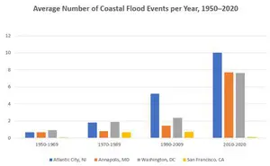
ielts buddy ebooks