IELTS Computer Delivered Tests + Band Score

IELTS Line Graph - Proportion of Elderly

by Sarvar

The graph shows the proportion of the population aged 65 and over between 1940 and 2040 in three different countries.

The graph shows the proportion of the population aged 65 and over between 1940 and 2040 in three different countries.

Hello everyone, please check out my essay. Friends check the coherence and cohesion, structure of the essay. Thanks a lot.

***

The bar chart shows some information on the population aged 65 and over in the UK. The data are available for 1985 and there is a projection for 2035.

As an overall trend, the proportion of people aged 65 and over will be by far higher in 2035 than in 1985. In 1985 the aging population has the largest percent of just over 15% in Wales. While the share of Northern Ireland is less by about fifth and is around 12% which is the smallest for the same year. By the year 2035, Wales will have the largest share in the aging population again, and it will exceed its own figure for the year 1985 by about two-thirds coming up to over 25%.

It is interesting to note that England and Northern Ireland will have the same shares of about 23% in 2035 whereas back in 1985 their portions significantly are not the same.

Comments for IELTS Line Graph - Proportion of Elderly

Click here to add your own comments

Oct 02, 2016
Off Topic
by: Anonymous

Are you joking? Wales? Northern Ireland?

Oct 05, 2016
my answer
by: Anonymous

A line graph depicting the percentage of elderly populace within 65 years and above in three countries(The USA, Sweden , Japan) between 1940 to 2040.Units are measured in percentage.

Overall,Japan had the highest percentage of elderly populace within 65 years and above at the end even though it started as the lowest at the beginning of the period.The USA had the highest percentage of elderly at the beginning but the lowest at the end of the period.Sweden had the second highest at the beginning and still ended in the same position at the end.
Japan started with a decrease in the percentage of the elderly populace while both The USA and Sweden started with increases.

Japan had the highest percentage of 24% elderly populace in 2040 while it had approximately 3% in 1960 which was the lowest.During the period between 1940 to 1960,Japan had a decrease in elderly population to 3% while The USA and Sweden had steady increases up to(10% and 8% respectively).

Nov 16, 2016
OFF TOPIC!
by: Anonymous

Hi.

I would advise you not to go off the topic, or else you will never get an overall band of 6 in writing task 1.

Please stick to the topic and try to cluster the ideas and show differences and similarities where needed. In your intro, you have to mention all the country names. In your overall statement, just say whose the highest and whose the lowest, you can right a maximum of 6 sentences in your overall statement.

Now with regards to your third paragraph, state the differences and similarities and try to cluster the points. I hope that you find the above beneficial.

Thanks.

Nov 25, 2016
Title
by: Sun kimhong

Are you kidding me? It sounds too complicated too me. I think the writing does not make any sense with the graph.

Dec 05, 2022
line graph
by: Raj

The infrographic representation of line graph depicts the information of the percentage of the population 65+ages in Japan,Sweden,the Usa from 1940 and also predicated to 2040.
Overall,it is a clear from the graph that the highest proportion of the population is expected in Japan. While,the Usa will have he least percentage of 65 or age people in future.
Looking at the graph in more detail, in 1940,the proportion of the population age 65 and over in the the Usa was 9%.Wheras,Sweden and Japan had 7% and 5% Population respectively.a slight increase in the percentage of 65 and over age group from 9%in 1940 to 10% in 1960. in the Usa,in contract,there was a slight decrease in the proportion of population in Japan from 5 % in 1940 to approximately 3% in 1960
After 2022, the proportion of 65 or above age group is expected grow in the given three countries.The highest percentage of 65 or over age group is projected in Japan. Which figure of nearly 27% Whearas,the least percentage of population is expected in the Usa it is accounted 22% by 2040.

Click here to add your own comments

Join in and write your own page! It's easy to do. How? Simply click here to return to IELTS Graph Feedback Forum.

Sample 2

by gaga
(Indonesia)

The graph shows the proportion of the population aged 65 and over between 1940 and 2040 in three different countries.

Generally, there is an increase for all three graphs to represent an the population of old people-65 and more years-old in three countries- USA, Sweden and Japan from 1940 to 2040.

All years are divided into five terms year. In the first term (1940), USA took the first place, in approximately 8%, then followed by Sweden in between 5% until 6%. The last rank is taken by Japan with 5% value.The rank position did not change until in the middle term (2020). Sweden, will rise dramatically at 20%, USA will follow which decrease gradually at about 14%. The last place still hold Japan at 8%. In the end of term, Japan will make steep inclination slope and reach first place at over 25%, Sweden will be the runner up at 25% and USA will be the last at about 23%.

Overall, Each country has inclination trend-line, with Sweden mostly placed the second level, USA and Japan exchange place from the first to the last term.

Comments for Sample 2

Click here to add your own comments

Feb 16, 2018
Some comments
by: The IELTS Guy

Hi.

Some comments on your answer.

For your first paragraph, remember that the graph is showing results that extend until 2040. This means that part of the graph is actually showing a projection into the future. You should try to include this in your description.

In your second paragraph you state "Generally, there is an increase for all three graphs. Itwuld be clearer to say that there is an increase for all three countries - there is only one graph.

In your third paragraph, there is probably no need to talk about the "5 year terms" as this is just a style used when graphs cover a long period of time. So you could say "In 1940 the USA had the highest proportion of citizens over 65, with 8%". Instead of saying "the middle term" you might say "In the years between 2020 and 2025..."

In your fourth paragraph you state that "Overall, Each country has inclination trend-line". A clearer and simpler way to express this is to say "Overall, each country has shown an increasing trend..."

I hope this helps. I have just launched a new website at www.theieltsguy.com that you might like to check.

Click here to add your own comments

Join in and write your own page! It's easy to do. How? Simply click here to return to IELTS Graph Feedback Forum.

Sample 3

by Rita Yem (Puma_andev)
(Shanghai, China)

Summarise the information by selecting and reporting the main feature and make comparisons where relevant.

You should write at least 150 words.


The graph outlines the comparison in the amount of ageing people in Japan, Sweden, and the USA. In general, it reveals that the percentage of elderly people is anticipated to soar to almost 25% by the year 2040.

In 1940 the figures of all three countries were negligible as compared with their results in 2040, only 5% in Japan, just about 7% in Sweden, and 9% in the US. As we can observe the proportion of ageing population slightly enhanced in Sweden and the US, making up 15% by the year 1980. By comparison, Japan’s figures somewhat deteriorated, maintaining 3% from 1960 to 1985 before rising again to 5% in 2000’s.

The graph suggests that amount of older people will almost certainly increase in next three decades in the three countries. The most drastic progress is expected in Japan between 2030 and 2040, by which time all three countries will reach similar highs.

==================================================

IELTS buddy
Feedback

Corrected Version:

The graph outlines the comparison in compares the amount percentage of ageing elderly people in Japan, Sweden, and the USA. In general, it reveals that the percentage of elderly people is anticipated to soar to almost 25% by the year 2040 to much higher levels than at present.

In 1940 the figures of all three countries were negligible as compared with their results in 2040, at only 5% in Japan, just about approximately 7% in Sweden, and 9% in the US. As we can observe the proportion of ageing population slightly enhanced increased in Sweden and the US, making up 15% by the year 1980. By comparison, Japan’s figures declined somewhat deteriorated, maintaining 3% from 1960 to 1985 before rising again to 5% in 2000’s.

The graph suggests that the amount proportion of older people will almost certainly increase in the next three decades in the three countries. The most drastic progress change is expected in Japan between 2030 and 2040, by which time all three countries will reach similar highs.

FURTHER COMMENTS


Overall, it's a good answers, with some good language and good organization. Here is some more specific feedback.

Grouping the Data

It is a good answer as you group the information well - dividing it up into a timeframe of the past and then the future. This makes it easy to follow.

Grammar

Some good use of grammar as you get the tenses correct - past for the first part of the graph and future for the second part.

Overview

It is better not to refer to specific data when you say what is happening generally in the graph, otherwise it will look like, or could be mistaken for, more specific detail.

This is why I changed your second sentence in the introduction.

Vocabulary

Amount = for uncountable nouns e.g. oil, water

Ageing people = you can say 'ageing population', but not 'ageing people'. We say 'elderly'.

Enhanced = This means 'to improve' something in terms of beauty or effectiveness. You can't use it to talk about graphs. It does not mean 'increase'.

Deteriorated = This has a particular connotation which is negative i.e. to get worse. But who is to say it is not postive if the number go down? You need to keep your answer factual in this respect.

Progress = Again, this has positive connotations of improvement and can't be used to explain movements of a graph. In any case, it is debatable if a massive increase in the elderly population is 'positive'.

You have some good vocabulary though:

  • reveals

  • anticipated

  • negligible

  • maintaining


Comments for Sample 3

Click here to add your own comments

Mar 30, 2013
proportion of elderly people
by: Anonymous

The graph compares the percentage of elderly people in USA, Japan and Sweden during a 100 years period from 1940 to 2040. Generally speaking the proportion of 65 and over aged people in all three countries distinctly increased during the mentioned period.

According to the graph Japan's figure beginning from approximately 5% in 1940 after a period of slightly rising experienced a dramatic increase in the last 10 years and reached to almost 27% in 2040 which is the highest point among all countries. The graph shows that although the percentage of elderly people in USA in 1940 was near 9% which was more than the others, at the end of the period it appeared as the lowest by approximately 25%. The Sweden's figure came between others.

It can be predicted from the graph that in the next future years the proportion of elders will hit a pick.

Jun 09, 2013
This is my writing can you correct for me
by: Anonymous

The line graph shows the proportion of the population aged 65 and over between 1940 and 2040 in the USA, Sweden and Japan.
In general, there were fluctuations in the proportion of the aging population 65 and over in three countries over the years.

To specify, in the USA, after a strong increase from nearly about 9 % to around 16.5% for the first about ninety years, the proportion of the population aged 65 and over went up dramatically to nearly 23 % in 2040.

By comparison, for the first ninety years, Sweden demonstrated upward fluctuations in the proportion of ageing population, going up from 7% to about 18%, before a rise to a peak of 25% in the last year.

Meanwhile, in Japan, fluctuating significantly between 5% and 10% for the fist ninety years, the rate witnessed an strongly increase to the highest point of nearly 27% in the last year.
Strikingly, only in about 2030 did three countries begin to raise to the highest point in the last year in the proportion od the population aged 65 and over.

In brief, over the years, the two countries significantly exceed the last country for the first ninety years but the opposite was true in the last years.

Jun 18, 2014
my opinion
by: saicharan

can introduction be like this


The graphs illustrates the percentage of elderly aged population in three different countries between the years 1940 and 2040.The graphs is evident that by 2040 the percentage of elderly aged population has increased by 25%.

=========

No - You can't say "The graphs is evident that...". It does not make sense. Say something like "Overall,.."

IELTS buddy

Sep 18, 2014
I have a question
by: Anonymous

what can be other form of concluding

Nov 02, 2014
pls check my essay
by: Anonymous

Given is the graph that illustrates the percentage of the population aged 65 and over till 1940 to 2040 in 3 various nations,namely Japan, Sweden as well as USA
First of all, Japan were lowest percentage of population at the beginning of the period.However, Usa were highest proportion of people aged 65 and over in 1940
Secondly, all that 3 nations proportion of population were upward trend between 1940 and 2040. USA was approximately 9%, Sweden was 7% as well as Japan was 5% at the beginning of the period,but, at the end of figure, they were approximately 23%, 25% and 28% respectively
In conclude, Japanese population were slightly increase between 1940 and 2030, but it were dramatically grow at the end of figure rather than USA, Sweden's proportion of population,

Feb 06, 2015
other synonymous of conclusion
by: Anonymous

To conclude - to crux , to sum up, to put in a nut shell, to recapitulate in short

Apr 18, 2015
please Buddy, correct my write up on this essay on Proportion of Elderly People
by: Athan Onwuka

The graph illustrates the percentage of a certain group (65 years and above) in three different countries from 1940 to 2040. Generally, Japan had the least percentage of elderly population from the start of the period, until at the end when it overtook the other two countries.

To begin, USA and Sweden has a fluctuation of elderly population. there is no significant difference between the percentage of people aged 65 years and above in USA and Sweden. they recorded 7% and 9% respectively in 1940 with little fluctuation, but USA took the lead in 1980 with 15% and Sweden 13%. Both countries had a tie in 2000 with a percentage of roughly 14, however, Sweden overtook USA and reached a fifth after year 2000. The fluctuation continued for these two countries, but it is proposed that the elderly population would nearly be a quarter for Sweden and little less than a quarter for USA.

The same can not be said about Japan whose proportion of elderly population was recorded as 5%in 1940 and continued to hit a low over the years unlike USA and Sweden. However,there would be a significant rise after year 2020, which is shown to be one in ten, and would continue to increase to a quarter thereafter, Finally, this population peaked a little above a quarter more than the other two countries at the end of the period.

Jun 20, 2015
comment for my writing, please
by: Anonymous

The given line graph shows the comparison of the aged population in three countries, namely: the USA, Sweden and Japan.

As it is clearly seen from the graph,the three countries population has undergone some fluctuation from 1940 to 2040.

To specify more explicitly, japan has a very significant increase in its elderly people between nearly 2030 to 2040 by 15% compared to the USA and Sweden which have a rise of approximately 9% and 7% respectively.

Overall, the percentage of aged population reveals that there will be an increasing trend over the years

Sep 08, 2015
please check this answer :)
by: Anonymous

The graph demonstrates the proportion of ageing population in three different countries, over a period of a decade. Time on the horizontal axis is plotted against ageing percent on the vertical axis.

In 1940, the proportion of people aged 65 or more stood at only 5% in Japan, approximately 7% in Sweden and 9% in the US. The proportions of elderly people in the USA and Sweden went up over a next 60 years while, the proportion of japan has a dramatic fall and reached a starting level at early 20s.
This ratio of population is supposed to increase suddenly till 2020 in japan and reach a peak at 28%.while, despite some fluctuations, the ageing population in Sweden and USA is analyzed to continue reaching 25% and 23% respectively in the same period.

Overall, the percentages of aged population in all the three countries is distinctly is increased over the mentioned period.


Sep 30, 2015
line graph
by: Anonymous

good explanation.

Dec 09, 2015
Score of this task
by: Anonymous

Could you write please, how much this task has been scored?

Jan 25, 2016
Pls check my graph - Proportion of Elderly People
by: 7 Bands

The given line graph shows the increasing and decreasing of population of 65 years old people and above among three countries namely Japan, Sweden, and USA.The x-axis shows the number of years while y-axis shows the percentage of order people.

In the beginning of 1940, the population of Japan, Sweden, and USA were 5%, 7%, and 9% respectively. After twenty years, Japan's population was reduced by 3% while Sweden and USA were increased by 9% and 10%. In the next twenty years Japan remain constant and rest of countries slightly exceeded by 5% only.Sweden and USA intersect to each other at the percentage of 14 before five years of 2000. Afterward USA remain same while Sweden has slightly increased.

In 2020, Japan suddenly increased and reached up to 8% and USA by 1% and Sweden has little declined by 2%. In the last twenty years the population was changed dramatically and rose. In Japan it rose and reached to around 27% while America and Sweden increased by same percentage that was near to 5.
To sum up all the information given above, in the last 60 years from 1940 to 1980,the population of three countries were fluctuating with slightly difference. From the rising trend of graph it can predict that it will rise almost three times.

Feb 09, 2016
pls chck my task...Line Graph: Proportion of Elderly People
by: Anonymous

The line graph portrays the volume of elderly people and above over a time period of 1940 to 2040 among three different countries.The data is given in percentage.

In Swedan, in 1940 the ratio of elderly people was started from approximate at 7% while for USA it was just 9%. for the next 40 years,sweden was followed by USA but in 1990 the scope of elderly people increased as compared to USA.In 2040,sweden and USA reached at 25% and 23% respectively.

On the flip side,Japan had very less proportion of aged people that was only 5% in 1940. In 2030 there was a inclined in proportion and reached at 25% and
it reached at 27% in 2040 that was peak value of japan.

overall,it is crystal clear that while japan had less proportion of aged populace as compared to other two countries in starting but it gained a peak value in last year.

Feb 22, 2016
am i correct?
by: Anonymous

The line graph compares the percentage of elderly people in the three countries namely USA, Sweden and Japan in the year 1940 and until 2040. It is clearly seen that majority of elderly are in USA in the first given year but eventually replaced by Japan in the year 2040.

In the beginning of the year, almost 9% of the population of the elderly belonged to USA, which is slightly higher than sweden and japan having just over 6% and 5% respectively.Both USA and sweden increased for a period of 20 years while, japan drop to about 4% and remained constantly stable until 1980. Likewise, for USA it maintained a percentage of 17% until 2020 and gradually rose up to a quarter.
On the other hand, sweden and japan kept rising up to 20% and 7% respectively. A prominent feature is that the proportion for elderly living in japan rocketed to just over 26%. Followed by sweden with a slight difference of 2% compared to USA.
Overall, as the years past by japan being the lowest source of elderly in the year 1940 it modestly increase and eventually soared the highest at the end year.

Feb 24, 2016
Average and estimated growth of elderly population
by: DANE

The line graph illustrates the average and estimated growth of elderly population between three countries USA, Japan and Sweden from 1940 to 2040. Overall, it is evident that the growth of senior citizens in these three countries increases over the time frame.

In 1940, USA had the highest multitude of senior citizen where it stood at under 10% and Japan had the lowest at 5%, whereas Sweden came in between them at roughly 7%. After four decades, in 1980, USA increased by more than 5%, while Sweden doubled its previous level at roughly under 14%. In the contrary, Japan's elderly citizens gradually declined and levelled at the same period just below 5%.

Subsequently, in 2000, the population in the USA of over 65 will be expected to slightly decline at under 15%, while Sweden and Japan will continue to escalate with 20% and 10% respectively. However, a further rise is speculated to happen by 2040, skyrocketing Japan's senior citizens into a new a height at over a quarter, while leaving the other two countries at under 25%.


P.S. I REALLY LIKE YOUR SITE, IT'S VERY HELPFUL FOR STUDENTS WHO ARE STRIVING TO GET A HIGHER BAND SCORE. I WOULD APPRECIATE IT IF YOU COULD PLEASE CHECK MY WORK. THANK YOU SO MUCH.

May 18, 2016
Line graph - 65 and over population
by: Guido

The line chart displays the percentages of elderly population in Japan, Sweden and the USA from 1940 to 2040.

Overall, all the three countries increased significantly their 65 and over 65 aged population over the period. America and Sweden showed similiar upward trends and Japan is predicted to have the highest rise in this specific population.

In 1940 the USA a tenth of the population was 65 or over years old, the highest proportion, and it progressively grow up to more than 15% in 1980, after that it remains relatively stable up to 2020, but a significant growth is forecasted in the following two decades, reaching more than 23%. Sweden the second most old country in 1940 with around 7,5% of the total population, showed a similiar increasing trend to America for 4 decades, but overtook it in 1990 and it's predicted to have a quarter of its population aged 65 or over in 2040.

Jaban, with just over 5% people in 1940, doubled its eledery population up to 2030, but it is expected to jump up to nearly 27% of the whole population in 2040, becoming the oldiest country.

Nov 03, 2016
Rahi shah
by: Anonymous

IELTS buddy plz check my graph:

The line graph illustrates the percentage of elderly people in Japan, Sweden and USA during the period of 1940 to 2040.

Overall, it is clearly seen that population of old age group was less at the beginning of period. Whilst, it would be boomed to over 25 % in Japan than others during 2030 to 2030.

In 1940,there was only 5% population of 65 aged group in Japan. While,the score of older people remarked about 7% in Sweden and 9%in USA respectively but this figure of older people went up approximately 15% from 1941 to 1980 in both counties. However, this percentage of elderly people declined nearly 3% in Japan in two decades.
Meanwhile, there is fluctuation in the expected percentage at the present time.the population of old people will be dramatically continue to increase at 25% between 2030 to 2040 in three western countries

Aug 22, 2017
my answer - Line Graph: Proportion of Elderly People
by: heryl

The line graph represents the rate, expressed in terms of percentages, of people who aged 65 and above from the year 1940 to 2040 in the USA, Sweden and Japan.

Overall, Japan and Sweden shows an upward trend of ageing population over the years. Although there are insignificant fluctuations. In contrast to the two countries, Japan shows a decreasing rate from the beginning of the year 1940, not until before the 20th century where an overwhelming rise of their ageing population took place.

To specify, in the year, the USA got the highest rate of aged people which accounts about 9% of their total population, compared to Sweden and Japan where it only has approximately 5.5 and 5 percentages correspondingly. USA and Sweden continues to rise its elderly population not until in the early years of the 20th century where Sweden equalled USA in its ageing community at approximately 14%. Both Sweden and USA continually rose its ageing society over the years. In contrast, Japan started with a downward trend in the beginning of 1940, but not after the year 1980s where it rises gradually with its overwhelming increment of ageing society starting in the middle of the years 2020 to 2040.

In conclusion, all the three countries show and increase number of ageing population over the years with Japan at its peak.

Sep 28, 2017
Task 1 correction
by: aterzgar

The line graph gives information about rate of the population aged group 65 and older than this between 1940 and 2040, for 100 years period, in disparate countries.First of all, The most old people were in USA. On the other hand, the least aged 65 and over 65 people were in Japan.

In 1940, USA has the most number of old people and it was under 10 percent .After then, Sweden is coming with 7 percent. Both of these countries having number of old people similarly increase up to 1980. Afterwards, both of them decrease but umber of people in Sweden jumped up to 2010.On the contrary that, USA remained steadily until 2020. Every two contries incresed their last 20 years and Sweden and USA reached to 25 and 23 percent respectively when it came to 2040.

Japan has had the least percent of aged 65 and over 65 people in the begining with over 5 percent. After then, it decreased constantly up 1960, 2.5 percent. Then japan continued stable between 1960 and 1990, for 30 years period.After 1990, it has started to increase end of the period but between 1990 and 2030 proceeded slower than remained years. Finally, in 2040 he reached the top with over 25 percent among all.

Jul 01, 2018
Proportion of elderly people
by: Anonymous123

The line graph represents the proportion of ageing population from 65 years old and above in three various countries.

Overall, it can be clearly seen that there is a surge of old population growth in the USA, Sweden especially in Japan from the beginning of 1940 to the end of 2040.

To begin, it is apparent that the USA has the leading populace amongst the three countries in the first period with approximately 9%. Whereas, Japan and Sweden were almost the same with the proportion of 5% and 6%, respectively.

The growth of ageing population continued to increase every decade. Until the last period of 2040, where Japan was ranked first as a country with old populace, accounted for 28%. Followed by Sweden with the percentage of exactly 25%. Consequently, the USA, from being the top ranked country with aged population in 1940 to the country with the lowest census amongst the given countries in the final period (23%).

Click here to add your own comments

Join in and write your own page! It's easy to do. How? Simply click here to return to IELTS Graph Feedback Forum.

Sample 4

by Renas

The graph illustrate the comparison between three different countries USA, Sweed, and Japan in elderly. Overall, the proportion of three countries going up from 1940 to 2040.

In 1940 the percentage of ageing in USA was below 10%, while in Japan was 5%, however, Sweed came between them. In the following years the rate of elderly in both USA and Sweed increased dramatically and reached a pick by 15% and just below to nearly 13% respectively. But the rate in Japan decreased slightly over the same period.

Afterword, from the previous time which is from 2000 all mentioned countries expect ;to increase and make a new pick. The figure suggested in the following three decades significant increase in ageing in each three country. Japan will reach the highest percent and scoring a new rate which is more than 25%, and each of USA and Sweed will come behind in different rate.

==================================================

IELTS buddy
Feedback

Corrected Version:


The graph illustrates the comparison between compares the proportion of elderly people in three different countries, USA, Sweden, and Japan in elderly. Overall, the proportion of elderly citizens in the three countries going up increases from 1940 to 2040.

In 1940, the percentage of ageing people in USA was below 10%, while in Japan it was 5%. However, Sweden came between them. In the following years the rate proportion of elderly in both USA and Sweden increased dramatically and reached a pick by peak of 15% and just below to nearly 13% respectively. But the rate in Japan decreased slightly over the same period.

Afterwards, from the previous time which is from 2000, all mentioned the countries expect to increase and make a new pick peak. The figure suggested In the following three decades there will be a significant increase in ageing in each of the three countries. Japan will reach the highest percent level, and scoring a new rate which is more than 25%, and each of USA and Sweden will come behind in different rate. be below this, at 23% and 25% respectively.

==================================================

FURTHER COMMENTS


Overall, you describe and compare things appropriately, but you have some problems with your language control.

It appears you are over-complicating things in places because as you can see I have often crossed things out because you have too much.

So try to keep things simpler.

I'd advise you to review some of the language of comparison needed to write line graphs and practice this.

Here you can view a lesson on describing a graph over time.


Proportion / Percentage

Be careful how you use these:

proportion of three countries = proportion of elderly citizens

percentage of ageing in USA = percentage of ageing people in USA

Comments for Sample 4

Click here to add your own comments

Dec 12, 2012
Help me please
by: Cuong Nguyen

Hi there, I've fond that your site is very useful for everybody who want to practice the IELTS. Can you do me a favor? can you pls check this writing for me, with the above line graph. I'm always feel very confuse of the writing skill..Thank you so much

____________________________

The line graph indicates the differences in the percentage of the elderly generation in USA, Japan and Sweden over a century, beginning at 1940. At the fist glance, it is clear that there is a basic general trend in the whole 100 years: the upward trend

As regards the first, the proportion of the elderly in the two Western countries rise gradually by varying degrees. USA witnessed a considerable growth in the percentage of the over 64 year old citizen in the first 20 years, increasing from 10% to 15%, then followed by a slight drop and a constant in the next 20 years at approximately 14% before it end up the year 2040 by a sharp surge at around 23%. Likewise, from 1940s to 1990s, the upward trend level of the elderly proportion in the Sweden was nearly the same with that in the USA, rising from about 6.5% to almost 13% then finish by a rapid surge from 17% to 25% within more than 30 years before suffering from a small fall beginning at 20% in the previous 15 years.

Another important point is that the elderly proportion of Japan started as the the lowest place among the three countries, at about 5%, but after fluctuating slightly until the beginning of 21st century, the pattern is reserved. There are 3 consecutive climb with difference degree, especially in the second one, the percentage of elderly citizen of Japan skyrocket suddenly from 10% to 25% in only about 2 years, exceeding the percentage of the elderly generation in the USA and Sweden for only 1 year and reaching to 2040 by a considerable increase to about 27%


Dec 14, 2012
Proportion of Elderly
by: IELTS buddy

Generally your answer is good so you don't have to worry much as you know how to tackle a line graph.

You introduce it, give the main point, group similar data together (western countries that have the same pattern) and then Japan which is slightly different.

Be careful with your tenses though - remember to always use the past tense if it is the past and future if needed. You do NOT use future tenses for time periods after 2012 - this is noticeable and will lose you points on your grammar.

You should also use 'however' when you go on to discuss Japan as you are making a comparison.

Dec 14, 2012
Thanks
by: Anonymous

Thank you so much for your promt response.. I'll note all that points. Have a nice day

Dec 27, 2012
the line graph description
by: ant

First of all I would like to thank the founders of this site as I found it very helpfull in my preparations for the ielts exam. The fact that it allows everybody to interact and share ideas makes this website unique and special.
Further more, I've tried to describe the line graph given above expecting some corrections and advices ...It is my first time to practice writing.. It took me about 40 minutes

------------------------------------------

The line graph represents how the proportion of old people changes in the USA, Sweden and Japan between 1940 and 2040. In general, it can be said that the percentage of the people ageing 65 and over witnessed a considerable rise in the three countries over the century indicated.
In the first 40 years, it was recorded a gradual increase in the number of old people reaching to 15% and a little less than 15% in the USA and Sweden respectively, whereas it slightly declined from 5% to approximately 4% in Japan. After that, the proportion of old citizens in Japan and sweden marked a steady growth, though the later showed some fluctuations, while in the USA it slightly declined by 1%.
It is predicted that old people will continue to make a higher proportion of the total population number till 2040 in the three countries. But Japan expect a dramatic increase, overcoming Sweden and the USA.

May 12, 2013
line graph
by: Anonymous

the line graph depicts the information about people who crossed the age of 65 in three different countries from 1940 to 2040.

Sep 17, 2013
The line graph
by: Narmeen

The line graph illustrates the proportion of elderly people between 1940 and 2040 in the USA,Sweden and Japan. Overall,the largest percentage of retirees will reach its peak by the year 2040 in Japan with a slightly noticed difference in the other two given countries.

As we can see,the biggest number of senior citizens was indicated in the United States and Sweden during the period of time between 1940 and 1990,that is both countries were following a similar pattern,going up to 15 per cent; whilst there was a completely contradictionary plight in Japan - the number of people aged 65 and over hardly reached 5 per cent.

However,as the time period goes closer to the twenty-first century,there is a whole new different situation to see: the number of retirees will boom up to a quarter in the USA and more than a fifth in Sweden by the year 2040,whereas there'll be a sharp sudden encrease in Japan: the population of elderly people will start considerably rising up to less than a third,beginning from the year 2020. Therefore,Japan will make a sharp upward trend by zooming up to 30 per cent from less than one in twenty in comparison with the other two countries,where the amount of given people has been encreasing during all periods of time.

So,one can say that Japan is a young country now and it will stay that way until 2040 when it will gradually get ''old''.


~~~~~~~~~~
Can you please comment on this essay? I really need to know if it's good enough foir Ielts exams and how much it will score. Thanks.

Oct 14, 2013
question
by: Baha Nosirov

As I know the 1 writing task should be about 150 words, and if there will be more words they can decrease the mark. But the sample essay has more than 200 words. Is this normal?? Won't they cut the mark??

Oct 20, 2013
Number of words
by: IELTS buddy

No, you get deductions for not writing enough words, not for writing too many.

Oct 22, 2013
My sample essay
by: Belle

Your comments are much appreciated!

The line chart illustrates the percentages of retirees in three countries from 1940-2040. It is clearly noticeable that there is at least a three-fold increase on these numbers in all the countries by the end of the period.

At the start of the period, only one in twenty of the population in Japan was 65 years old and over while there was around seven percent and less than 10 percent of them in Sweden and the USA, respectively. The latter countries generally followed the same gradual increasing trend throughout the given century although there was a slight variation in the 30 year period which started in 1980. To name these variations, Sweden had a marginal decrease then an abrupt increase to 20 percent in 2010 while the USA slipped back to less than 15 percent and had remained unchanged until a few years before 2020. A quarter of the population in Sweden is projected to be senile by 2040 which is two percent greater than the numbers from the USA.

On the other hand, Japan had a different trend. There was a two percent decrease in the number of senior citizens during the first two decades which remained constant until the late 1980s. It is then followed by a slow and steady increase to 10 percent in the succeeding four decades. Afterwhich, the percentage then leapt to about five times greater than the number in 1940 and Japan is projected to have at least 27% of their total population as retirees by 2040.

In a nutshell, the ageing population gradually rose on all three countries and they will comprise more or less a quarter of the total population by 2040.

Oct 25, 2013
Hi , I've found your site is awsome for ielts students because it contains lots of helpfull answers but am worrying about line graphs if you can please check this for me Thank you so much
by: kavindu

The graph represents the percentage of the population from 1940 to 2040 in three different countries.

To begin with, all the percentage in 1940 was below 10%, approximately USA-8%,Sweden-7.5% and Japan 5%. Japanese proportion of population aged 65 and over achieved highest proportion in 2040 while the least was in USA approximately just below 25%. In 2040 Sweden achieved quarter of the population.

Secondly, the grow illustrates marked up increase between 2020 to 2040 in Japan. In 2000 USA and Sweden percentages was same, which was 14%. There was no variation in Japanese population between 1960-1985.

Overall Japanese proportion of population was tend to increase than other countries and USA population was tend to decrease than others. However, Sweden always came between USA and Japan.

Oct 30, 2013
please help me to check this!
by: April Ta

The chart shows the information about the population of the elderly in three countries between 1940 and 2040. The vertical line represents the percentage of the population, and the horizontal line is the period over one century. The diagram describes the increase dramatically of the senior citizens.

According to the line graph, both USA’s and Sweden’s proportion of elderly rose sharply (10% and 8%, respectively), while the Japan’s silver population decreased. After 1960, the USA’s and Sweden’s population surged rapidly (about 15%). The USA’s elderly is predicted to remain the same until 2020, and then reach a pick of about 23% (2040). Similarities, Sweden’s elderly is foreseeing to rise in future. The Japan’s population has stable till 2000s. However, especially from 2020, it will begin to increase dramatically.

Overall, it is possible that all three nations’ population will rise gradually in future, and Japan’s silver population will be the highest.

Nov 07, 2013
task 1 responce
by: Anonymous

The graph compares the percentage of 65 eldery people in three different countries,USA,Sweden and Japan from 1940 to 2040.Generally,the proportion is on the rise in all those countries.

In the western countries, USA and Sweden,the pattern was quiet similar. As it accounts to approximately 8% in USA In 1940,the trend was generally stable around 15% from 1980 to 2020 before finishing at almost 20% by 2040.The percentage doubled in Sweden over half a century from just 7% to 15% in 2000.However,the ratio of is expected to stand at 25% slightly more than USA.
One the other hand,there was a significant difference in Japan.Although the percentage was only 5%,it declined far below this over the first 20 years before plateauing over 1980s.There is a sharp increase in Japan as figures is expected to rise from 10% to more than 25% in only the last 20 years.

In conclusion, the graph reveals that, the eldery people would occupy a significant ratio in either the eastern and the western countries

Nov 10, 2013
Treat Japan between 1960 and 1085
by: Anonymous

In case of Japan, Between 1960 and 1085, the rate is nearly flat

Nov 11, 2013
Part of a sample
by: RZQ

The three line graphs compare the percentage of population aged 65 and over in USA, Japan and Sweden from 1940 to 2040:. In brief, it is clear that the three line graphs showed an increase over the century. (38 words)

In detail, the proportion of people aging 65 and over in the USA was a little below 10% in 1940 in Japan, it was 5% and Sweden was in the middle. Between 1940 and 1960, the same percentage rose slightly in USA and Sweden to 10% and 8%, respectively, while in Japan, there was a slight decline in the same percentage to approximately 3.5% before it remained stable until the late 1980s.

Nov 25, 2013
english
by: Anonymous

hi there i read most of your essay and compared them with mine and they were amazing

Dec 01, 2013
control
by: Anonymous

The line graph illustrates information on the proportion of the population aged 65 and over in percentages between 1940 and 2040 in three countries.

First of all, proportion of population aged 65 and over is the highest in usa in 1940. It is about 9 percent. it slightly increased from almost 9 percent in 1940 to exactly 10 percent in 1960.After 1960, proportion of population aged 65 and over is significant went up until 1980s. It increased from 10 percent in 1960 to 15 percent in 1980s. But, it decreased in 2000. Then, remained steady from in 2000 to in 2013. After, it is expected to remained steady until 2020. However, proportion of population aged 65 and over is expected to increases until 2040. it is about 23 percent in 2040.

On the other hand, proportion of population aged 65 and over is slightly increased until 1980 in Sweden. It from about 7 percent in 1940 to abroad 14 percent in 1960. It declined from about 14 percent in 1960 to approximately 13 percent almost 1995. After this years, it increased until 2013. Nevertheless, it is expected to decrease about 18 percent in 2020. Then, it is expected to significant increases exactly 25 percent in 2040.
Finally, proportion of population aged 65 and over in Japan has the lowest amoung the three countries between 1940 and 2013 and expected to until about 2030. But it is expected to the highest rate in Japan with about 27 percent in 2040.

Morever, in USA and Sweden have a fluctuating trend between 1940 and 2040. But, in Japan has a remaining trend from 1960 to 1980. In the other years it has a fluctuating trend.

Jan 02, 2014
hi,please help me!!!
by: gunjan

Hi,My name is gunjan.Can you please tell me that in any graph we have to make 3 comparisons, and what about the rest of graph.we have to discuss it or not?

Jan 05, 2014
IELTS Task 1 Line Graph: Proportion of Elderly
by: IELTS buddy

Hi,

I'm not really sure what you mean by your question.

There is no fixed number of comparisons. You need to make sure you discuss all the key features / important points.

If there are 3 then discuss those 3. If there are 5, discuss the 5. It depends on each graph.

Thanks

Jan 24, 2014
Can you do me a favor? can you pls check this writing for me, with the above line graph.
by: Anonymous

The line graph compares the increasing population aged 65 and over from 1940 to 2040 in USA, Sweden and Japan. As can be seen from the line graph despite some fluctuations population increased over the period.

Between 1940 and 1960, USA shows gradual increment in population from 9 % to 10%.Following that year, the population increases steadily to 15% in 1980 almost three times greater population than Japan and remained constant till 2010 and ended up with 23% in 2040. Sweden also shows the similar trend fluctuating over the period but the trend was upward reaching 25% of the total population.

Whereas, the proportion of population aged 65 in Japan decreases gradually from 1940 to 1960 and remained stable for 20 years .Then the population in Japan increases slowly to 10% in 2005 and shows steep increase and reached a top of 27% in 2040.

In conclusion, population aged 65 and above increased throughout the period in all three countries.

Feb 24, 2014
I would be very grateful if you would check my sample! Thank you in advance!
by: A_n_o_n_y_m_o_u_s

This line graph represents the percentage of population over 65 years old for Japan, Sweden and USA from 1940 to 2040. According to the legend, population change for Japan is described by the thin line, for Sweden a dotted line and for USA a solid line.

In 1940 the elderly population of Japan made up 5% among overall Japanese citizens. On the other hand, Swedish population aged 65 and over was around 7% and USA’s almost 10%, approximately 4% more than Japan. From this time, USA’s and Swedish senior inhabitants steadily increased to around 15% in 1980, while Japanese inhabitants of the same age made up about 3% between 1960 and 1988. From 1980 till present elderly population of USA remained stable at around 14.5%, at the same time, Swedish and Japanese population continued rise gradually to 20% and nearly 6%, respectively. Interestingly, the data predicts that the percentage of senior residents of Japan will surpass the percentage of USA’s and Swedish senior population in 2030. Until 2040 population over 65 years old of all three countries will proceed to grow, which will make up practically one fourth of general population.

By comparing these trends during the century, it can be said that birth rates in these countries change over the whole period of time and in the next two decades it will have a marked decrease.

Mar 29, 2014
please check my writing anyone?
by: dad

The line graph illustrates the percentage of elderly population aged 65 and above in three different countries between 1940 and 2040, a period of 10 years. Overall, the percentage of old citizens in the Japan country declined over the year period, whereas in the Sweden and USA population increased and shows similar pattern throughout the year.

In 1940, the proportion of aged population in Japan was the least compare to the other two countries with an average of 5%, it then shows a period of stability between 1960’s and 1980’s. It can be seen that the proportion of aged citizen gradually increase throughout 2000 and 2020, with a sharply increase in the middle of year 2020 and 2040 with an average of 25%, until it overtook the level of aged population in Sweden and USA and finished just over 25% in 2040.

In sharp contrast to this, the proportion of aged population in Sweden and USA shows similar pattern throughout the year. The aged population in Sweden increased gradually from 1940’s and 1980’s,with a percentage between 7% and just under 15%, exceeding the number of aged population in the USA before the year 2000 and finished just under 25%. Similar pattern can be seen in USA, increasing gradually from 1960 and 1980, with a plateau from before year 2000 and 2020, it finished just under the 23%.

Apr 03, 2014
hi , can you correct my essay !
by: najla

The line graph demonstrates the proportion of the population aged 65 and over between 1940 and 2040 in three different countries as in indicated on the x-axis.The y-axis indicated the percent proportion of elderly people .According to the legend proportion of population aged 65 and over is described by the solid line in the three different countries .


In 1940,the percent of USA was under 10% whereas the percent of the elderly in Japan was lowest at 4%, whilst Sweden was in the middle of theme .

The percent of the elderly in these the three countries will changes through 30 years. The percent of the elderly in Japan will rapid at 27%as also USA will 25% respectively whereas Sweden will be under at 23% .

Clearly , the line graph expects that the percent of the elderly in these the three countries will change significantly over 25 years

Apr 06, 2014
My Sample Writing
by: Raj

Can you please check my writing and let me know how much can i score in this task in Ielts exam.


The given line graph compare the trends in the population pattern of aged 65 and over in three different countries within a time span of 100 years.The years are shown on X-axis while the proportion is on Y-axis.

It can be seen that there is a continuous decline in the population pattern in Japan from 1940-1990 and afterwards it shows a dramatic increase from 5 percent to more than 25 percent till 2040.

However, both Sweden and USA shows almost a similar pattern with ups and downs. Both the countries increased steadily at a similar rate until 1980 while there is a constant downfall in the US economy from 2000-2020. and after this it gained momentum and reached a level of 23 percent. On the other hand, Sweden with continuous troughs and peaks stands in the middle of both countries with a level of 25 percent population of 65 years and above.

Apr 16, 2014
Writing a paragraph
by: Anonymous

The three broken lines show the relationship between Population of ageing people 65 and above over the years 1940 to 2040 in three different countries.

In 1940, the Proportion of Poulation over 65 was about 10 % in USA. Below this proprtion, Sweeden' came the second about 8% and Japan the third about 5%.

The percentage proportions for the two countries USA and Japan continued to increse until they reach a peak of 15 % in 2000.Afterwards, USA continued its dramatic increase up to 20% and expected to show slight decrase to 17% in year 2017. In contrast, Sweeden was expected to remian steady between 2000 and 2040.

Japan was expected to reach above 25% in 2040.
Please kindly feedback and correction.

Apr 25, 2014
coukd you please give feedback
by: Anonymous

the line chart depicts the percentage of elderly population in three different countries, which are Japan, Sweden and USA from 1940 to 2040. Overall, the proportion of those three countries increases over the years

In the begiining year of the graph data, which is in 1940, elderly population in USA outnumbered the other countries with almost 10% whereas Sweden followed in second position with about 6% and Japan, the only asian country, was in the last position at 5%. For both of western countries, the same trends kept continue until around 1998, wheres USA was the highest country with old people and Sweden as the second one. However, after 1980, old population in sweden dramatically increased and took over the USA posistion as the highest country with ageing population. Sweden reached its peak in about 2010 with 20% ageing population, then went down slightly.

Different trend happen in Japan. It started with the lowest ageing population, then slightly fell until 1960 and moved steadily until around 1985. During those times the changes was around 2% only. Neverthless, after 1985, the old population in Japan slightly climbed up and would be predicted to rocket out in 2020, then would be estimated to claim the highest ageing population in around 2030 compared to western countries in the graph

Apr 29, 2014
Kindly check and approximate rating. Thanks!
by: Gico

The line graph depicts the percentage of elderly people aged 65 and above in USA, Sweden and Japan between 1940 and 2040. It is clear that the proportion of senior citizens is increasing in these countries.

In 1940, the proportion of older individuals in USA is at about 9% and Sweden at approximately 7%. Both countries significantly increased its trend until 1980. However, USA had a slight decrease in the late 2000 and maintained its rate at a little under 15% for 20 years and had a sharp rise in 2020 with its peak at 23%. Sweden, on the other hand, though had a minimal decline in 2000 and late 2020, generally had a rising trend and had its highest proportion at 25%.

Japan started at 5% in 1940 and slowly declined until 1980. The rate gradually rise from 2000 and had its steep climb in 2010 and its peak in 2040 at about 27%.

One may conclude that aging population in 3 nations is growing. Moreover, these countries doubled the population share of elders in a century.

May 03, 2014
Proportion of Elderly
by: DHARMA

The graph describes the percentage of the aged people in three different nations from 1940 to 2040.

In 1940,the percentage of ageing people in USA was below 10%,while Japan was very less figure in starting year 5% only and Sweden was 7% respectively.In following year rate of elderly people was increased to 15 per cent in USA and Sweden in 1980.But Japan was slightly decreased and maintain constant in same period.

In 2000 all three countries shown a great significant throughout the end.Japan was dramatically increased to 27 per cent in 2040.USA and Sweden was hit 20 and 25 per cent in end of the year respectively.

Overall,Japan was the highest aged population in 2040 and USA and Sweden was maintain constant growth end of the period

May 09, 2014
Hi all, this is a very helful site. please check my writing and give me some suggestion. Thank you very much.
by: duongquy

The line graph shows the rate of population at the age of 65 and over 65 in three countries from 1940 to 2040, as indicated in X-axis. The Y-axis shows the percentage of people in each country from 0 to 30%. According to the legend, the proportion change for USA is described by the black solid line, for Sweden a blue solid line and for Japan a red solid line.

In 1940, the rate of the elderly in the USA stood at the first place of 10%, followed by in Sweden and Japan of about 7% and 5% respectively. From this time, the rate of elderly people in the USA and Sweden was gradually increased to about 15% and 13% respectively in 1984. On the other hand, the elderly in Japan was gradually decreased to about 3% in 1984. After that time, this rate has sharply been increased, and those reaches a peak of over 27% in 2040 while those in the USA has slightly been decreased by approximately 2-3% between 1983 and 2020, and then sharply increase at about 23% in 2040.

Interestingly, the rate in Sweden has been fluctuated after 1983, and those reaches to 25% in 2040. According to the information in this line graph, the rate of the USA had equal to Sweden at about 14% in 1998, then the elderly in Sweden has been surpassed in the USA from 1998 to 2040. It is also projected that both the USA and Japan will have at about 18% in 2030, and Sweden and Japan will have at about 22% in 2030.

Clearly, the graph indicates an expectation that the elderly in three countries will increase in the future in general, and the rate of old people in Japan is the highest.

May 15, 2014
Would someone provide some tips or comments on my writing?
by: Calvin

The line graph illustrates the number of elderly about the age of 65 as a percentage over the total population of their respective counties over a period of 100 years between 1940 and 2040. At first glance, it is clear that an overall upward trend is observed across the three countries although inconsistent.

To begin, the US had the largest portion of elderly at almost 10%, followed closely by Sweden at 8% and Japan at 5% in 1940. A similar pattern is noted for the US and Sweden which both experienced gradual increase of elderly up till 1980. Following this, a brief decline was observed before a small rise in Sweden’s case to meet the US figure at 14% in 1999. Thereafter, Sweden’s elderly population rose year on year up to 2014 with an anticipated drop into 2030 before finishing at 25% in 2040. Meanwhile, US’s elderly population experienced a modest drop and is expected to remain stagnant to the end of 2017 before raising upwards. It is expected by 2040, slightly more than a fifth of Americans will be above aged 65 compared to Sweden’s expected figure of a quarter.

In sharp contrast, Japan’s elderly population slumped into the 1980s before a brief rebound back to its previous level of 5% in 1940. Japan’s elderly proportion vis-à-vis its population is expected to soar significantly into 2020s. It would surpass both US and Sweden’s figures by 2030, propelling it to be the country with the highest elderly at 28% in 2040.

May 21, 2014
My writing Task 1
by: Mari

Hi, can you give me some advise about my writing task 1? Thank you in advance.

The following line graph illustrates the variation in percentage of people over 65 from 1940 to 2040, in three different countries: Japan, Sweden and the USA.

First of all, it is notable in Japan's trend a lower percentage (about 5%) of old people until 2020 than the other two Countries, by contrast it will rocket by 2020 to reach a peak of almost 30% in 2040.

Let us consider now the USA and Sweden. They have a gradual upward trend starting in 1940 with a percentage respectively of 9% and 7% to grow until 23% and 25% in 2040.

However, there is one noticeable exception in the three decades between 2000 and 2030, where Sweden will held un upward trend, while the USA will stay stable .

In summary, the gradual trend is upwards. The largest increase will be in Japan while the lowest rise is predicted for the USA in contrast with it happened in the past.

Jul 08, 2014
CHECKOUT THE MISTAKES
by: Garry

THE ASSIGNED LINE GRAPH SHEDS LIGHT ON THE PROPORTION OF AGED PEOPLE IN THE THREE DIFFERENT COUNTRIES BETWEEN 1940 AND 2040.

Jul 09, 2014
Best Website for IELTS
by: Harvinder

WOW!, This website is so helpful for the students those are planning to take IELTS. Instructions to describe graph is so clear to understand. Moreover, students written graphs are a good way to find out common mistakes and to improve them.

Aug 03, 2014
sample: pls comment, it will be much appreciated
by: pinoy

The figure is all about the population of three nations coming from Japan, USA and Sweden who aged 60 years and older from 1940 to 2040, a period of a century. Overall, the percentages of the population from these all countries are expected to increase. In particular, Japan will be anticipating this phenomenon.

In 1940, USA had the highest population at the outset of the period, having nearly 10%. Two decades after it increased insignificantly at exactly 10%. This trend continued to rise by 5% 40 years later. However, it dropped slightly to approximately 13% after 20years. The population of the 60 year old and above from this country will be expected to taper off until 2020 and is anticipated to inflate to less than a quarter by the end of the period.

In Sweden, it had about 7% of senescence population in 1940. This proportion almost doubled in 1980, although a drop was noted in the 1990s. However, it is expected to experience resurgence in 2040 until reaching a quarter of total population from this age group. On the other hand, Japan who had the lowest population of the same age group at 5% in 1940 showed a downward trend up to mid-1990s. The figure then slipped back to 1940 figure in 2000. Surprisingly, it will be foreseeing to grow by more than fivefold rise in 2040 and will be the experiencing to have the highest percentage of 60 years old and older people.


Aug 31, 2014
Please edit and comment on my essay :)
by: Sweet Kaye

The line graph compares the percentage of the ageing population (65 and over) in three countries: USA, Sweden and Japan over a century (1940-2040).

Japan, in 1940, had the least amount of old people - only 5% compared to Sweden and USA which had about 7 % and 9% respectively. Japan, being the lowest on the charts, retained it's position not until around 2030 when something very interesting happened to the Japanese line. From just merely 10%, it skyrocketed to 25% in just 1-2 years! This was the reason why in 2040, Japan has surpassed the other two nations - with elderly individuals comprising almost 27% of it's population - certainly 2% higher than Sweden, and much higher than America by approximately 4%.

Meanwhile, between 1940 and 1990, USA and Sweden were neck and neck with the proportion of elderly population and equalled in 1992-1993 at nearly 15%. It was only in about 2010, when USA plateaued at roughly 15%, that Sweden eventually took the lead over America by 5%. This means that there were 5% more people aged 65 and over in Sweden than in America in 2010.


Sep 09, 2014
please check this answer and give me score
by: Anonymous

The line graph shows that three different countries USA, Sweden and Japan, population proportion aged 65 and over between one decade from the 1940. Over all proportion of three countries going up.

In USA nearly 9 percent of total populations were elderly people on the other hand Japan has only 5 percent and the case of Sweden was medium range of USA and Japan. After two decade USA and Sweden were slightly increased their proportion but Japan decreased by approximately three percent. In 1980 USA and Sweden equally rise their proportion at the same time Japan was same as 1960. According to the graph in 2000 USA were no change after long time but Sweden was go up significantly however Japan starting for rise.
Furthermore, in the mid time of 2000 and 2020 there is a lot of fluctuation all three countries. We can see the graph we assumed that, after 2020 proportion of elderly population will increased significantly both USA and Sweden but the case of Japan there will be dramatically.

In conclusion, elderly population proportion is being highly every decade and it will be creating problem due to vacuum of young people.

Oct 05, 2014
Report
by: Hoang Nguyen

Can you correct the report for me please? Thank you very much.

The line graph compares the rate of elders in U.S., Japan and Sweden from 1940 to 2014. Overall, it can be seen from the graph that all three nations experienced an upward trend through the whole time frame.

Over the first 6 decades, the rate of old population in USA and Sweden followed a fairly similar pattern. The figure for Sweden then increase gradually, ending the period at 25%. From 2000 to 2020, the share of ageing people leveled out at just under 15%, followed by a sharp rise to 22.5% in 2040.

The proportion of the old in Japan started at 5% in 1940, which is slightly lower than that of the others. It then dipped in the next two decades before experienced a steedy rise to 10% in 2030. The last ten years of the period saw a boom in the rate of elders, leading to Japan’s first ranking in the number.

Nov 08, 2014
please check this answer and give me score
by: BANANA

Given is the graph that illustrates the percentage of the population aged 65 and over till 1940 to 2040 in 3 various nations,namely Japan, Sweden as well as USA.
First of all, it is evident that Japan was lowest percentage of population at the beginning of the period.In contrast, USA was highest proportion of people aged 65 & over in 1940.
Secondly, all that 3 nations proportion of population were upward trend till 1940 to 2040.USA was 9%, Sweden was approximately 7% and Japan was 5% at the beginning of period but, at the end of figure, they were 23%, 25% and 28% respectively.
By the way of conclusion, Japanese population at aged 65 & over were slightly increase between 1940 & 2030, but it were dramatically grow in 2040 rather than Usa and Sweden's proportion of population

Nov 20, 2014
Pls. comment on my writing skill. thank you.
by: Anonymous

The line graph illustrates fraction of population aged 65 and above from 1940 to 2040 in separate territories.

Overall, It showed that there was a decrease in percentage of elderly population in U.S.A, whilst countries Japan and Sweden had similar increase.

In 1940's Japan had 5 out of its 30 whom where aged 65 years and over. This was slightly lower than the fraction of Sweden and U.S.A. As we can see on the graph, the country had a decline having 3 out of 30 in 1960 and got up to slight increase in succeeding years. It had 60 years of having the least number of elderly aged from 1940 to 2000. In 2007, its population slowly climbed and in 2030 started spurting its growth to 27 out 30 which indicated to be highest in percentage in end of 2040.

Moreover, the countries of U.S.A and Sweden were slightly higher apart from Japan in 1940's. Later, both were slowly inclining its numbers by 5 percent from 1960 to 1980. Moving over years, Sweden left an increase more than 5 percent than U.S.A until 2018, making 20 out of 30. In 2027, Sweden came down 2 percent and U.S.A slowly increased making it 25 percent and Sweden 23 percent and by end of 2040.
By the end of the year, Japan had the highest fluctuate on population increase. The others had similar increase but was left behind by Japan in a dramatic growth.

Dec 08, 2014
Elderly Growth in USA, Sweden and Japan.
by: beginner

the graph above gives the percentage growth of elderly in three different countries- USA, Sweden and Japan, from 1940 to 2040. While looking at the graph, a rising/increasing trend can be observed in all the three countries with some fluctuation in the the specified timeline.

In 1940, USA holds the maximum percentage of ageing people with approximately 10%, followed by Sweden and Japan with 7% and 3% respectively. In the following years, USA and Sweden witnessed an increasing trend in ageing proportion whereas Japan, it was steady decreasing trend in the elderly proportion. By 1980, USA had Sweden had risen percentage of elderly people, of 15% and 13% respectively. However, in japan, the proportion was reduced to 3%. Dramatically, in 1995, Sweden took the lead in elderly proportion over USA with 18% of elderly proportion.

By the year of 1999, the proportion of elderly growth started to increase in japan. Surprisingly and unexpectedly, Japan had the highest percentage in the 2030 among all three countries 28%. By 2040, Japan had 28%, Sweden had 25% whereas, in USA, it was 23%.

Dec 26, 2014
good]
by: Anonymous

good

Jan 05, 2015
Manish Gautam
by: Anonymous

This line chat discribe the Elderly proportion between countries.In ---- year the USA population growing from 10%,japan from 15% ans sweeden growing between both of them.

Some time latter,the USA population reached at 15% in 2000 ans sweeden is 0432

Jan 30, 2015
Please Review IELTS BUDDY
by: Anonymous

The line graph compares the percentage proportion of population aged 65 and over in USA , Sweden and Japan from year 1940 to 2040.

From the line graph, an overall increase the proportion of population aged 65 and over is observed in all three countries.

In 1940 , 10 % of the population of USA was aged 65+ , and a continuous rise is observed until 1980 after which the population of elderly remained constant at arround 15 %. The proportion of Sweden was almost equal to USA, but in 1990’s its elderly population became more than USA and reached 20 %. Japan on the other hand from 1940 to 2020 had the lowest of elderly population and a gradual of 5 % rise is elderly population is observed. After 2020, the elderly population proportion increased in both USA and Sweden, however in comparison a sharp dramatic rise is observed in Japan where elderly population increased from 10 % to 25 % within period of few years leaving behind both USA and Sweden.

Feb 25, 2015
Please help me checking this one
by: Anonymous

The line graph displays the rate of population whose age were 65 or over in three separate countries from 1940 and predictions for the next few decades.

In terms od the United States and Sweden, the percentages of this age group grew from 1940s to 1980s when they started to slide. This slight decrease in old resident of America is predicted to last until 2020 before slowly recovering and reaching the level od approximately 23%.
Meanwhile, Sweden's recovery occured sooner. The 1990s witnessed the upturn of old population in Sweden. However, this rate is expected to decline in 2016, which will give rise to the growth in 2020 and end the period at 25%.

Regarding to Japan, the country kept their rate of old age group just under 5% in roughly seven decades. There was a considerable increase in 2010 which is predicted to followed by a further improvement. This rate of Japan suddenly dramatically climb in 2030 until it reach a peak at over 25%.

Mar 13, 2015
This website is unbelievably useful.
by: Anonymous

This line graph illustrates the proportion of the population aged 65 and over between 1949 and 2040 in three different countries: USA, Sweeden, and Japan. Overall, the proportion of the population aged 65 and over in all these coutries keeps rising from 1949 to 2014.

Before around 2030, the proportion of ederly in USA and Sweeden is higher than that in Japan. After that, however, Japanese proportion of elderly suddenly climbs to point steeply where is higher than those in USA and Sweeden. In addition, the propotion in USA is on top of the proportion in Sweeden before 2000, and this situation changes after it, which sweeden's proportion of ederly keeps higher than than in USA.

At the beginning of 1940, the proportion in USA is nearly close to 10%, whilst Janpanese proportion is 5%, and 7% in Sweeden. But this kind of situation is totally different when it is in 2014. The proportion in Japan increases to more than 25%, which is far more higher than the proportion in USA and Sweeden. Both of them are under 25% in 2040 although they keep rising from the very beginning.

Mar 15, 2015
isn't that good
by: Anonymous

The proportion of population who aged 56 and over in three countries [ Japan,USA and Sweden ]between 1940 and 2040 are illustrated by the graph.It is clear that, the trend is upward over the coming years .

It stood at 1940 ,that the percentage of aging people in the three countries were 5% for japan ,10 for USA while Sweden came between them.However, the proportion of elderly started with a slight rise in USA,until 1960 it stared with a significant increase which reach at 15%. In Sweden remained stable during the first decade, and then it followed the same increase of USA , but in smaller level and read a peak about 12%.on the contrary, in Japan the proportion of elderly , there was dramatic fall in the first decade which reached at bout 3% .it is estimated that proportion of elderly will increase over the incoming decades just over 23% in the three countries.Therefore the percentage of elderly in Japan will get sudden sharp increase making a peak of over 25% which is the highest percentage comparing with USA and Sweden . moreover , in USA and Sweden will be dramatic rise over the two decades at boat 23% and 25% respectively..


Apr 01, 2015
Sample IELTS Task 1 Line Graph: Proportion of Elderly
by: mojgangoodarzi

The graph gives information about proportion of how many people lived a particular area, country with aged 65 over this ten-year period at the interval between 1940 and 2040 in three different countries including USA, Sweden and Japan.

According to the line graph, proportion of crowed aged 65 and over in the USA are increased from approximately 10 to 23 respectively in 1940 to 2040.By contrast, Japan decreased steadily between 1940 and 1990 from about 5 to 2.5 and then there are a sharp rise of group in subsequent years from 10 to 25 and reached up to 28 in 2040.Whereas, Sweden are fluctuated but in overview, it increased.

In a nutshell, ratio of elderly are up grade and at the end, Japan are the most value of people in over ten decades .Nevertheless, Japan in the first of period are the lowest proportion and the other.(150 words)

May 05, 2015
My version. Please help. Thank you.:)
by: Anonymous

Hi IELTS Buddy! I've been using your website as my reviewer as I take my exam by the end of the month. I would like to ask for your assistance in preparation for my exams. If you have time, please do check my answers with regards to your sample tasks. Thank you very much!


The linear presentation illustrates the percentage of elderly, aged 65 and above, in 3 various countries over a period of 100 years.

Overall, Japan reveals a sudden growth of percentage in elderly at the end of the century although it started being the least, whereas the proportion of USA and Sweden old-aged citizens fluctuates all throughout the period.

In 1940, Sweden and USA started almost 7% and 9% rate, getting ahead with Japan. Rapidly, the percentage increases from almost 10% to about 15% between 1960 and 1980.However, American and Swedish elderly percentage fluctuated from 1990 and 2040. America suddenly leveled off for over 2 decades with 14% respectively then reaches its peak at 23% by 2040. On the other hand, Sweden's elderly rate sharply increased by 20% in 2010, fluctuated by 2030 with 17%, then rises to 25% in 2040.

In sharp contrast with this, Japan elderly provided a proportion of 5%. It then fell almost 4% in 1960 and remained stable, 3 decades after. In 2000, there was a gradual increase of rate, gaining back to 5%. It grew sharply by 10% in 2030. Continuously, Japan reveals dramatic growth within the year with a rise of 25%, going beyond two other countries' rate. By the end of the century, Japanese elderly reaches the peak at 27% respectively.

May 07, 2015
Help me for check my grammer and score, please? Thanks before
by: Yossy

The line graph above describe the amount of old people in USA, Swedan, and Japan from 1940 to 2040. As can be seen in the graph, the number is rising by the year 2040.

The first things to note from the graph is all of those countries have a huge number of comparison in 2040 from 1940. USA with 9%, Swedan with 6%, and Japn with only 5%. the percentage of USA and Swedan increase significantly from 1940. However, in 1980, the number fall slightly before they recover again in1985 and 2019, respectively. In Japan, there was a slight fall in the number of older people between 1940 to 1985. But it recover in1980 and rise sharply in 2030.

From the graph, we can notice that Japan is the country which has the most drastic progress. It cause Swedan, Japan, and USA have a similar rate in the end of 2040

May 08, 2015
Kindly check my report! - IELTS Task 1 Line Graph: Proportion of Elderly
by: Anonymous

The graph shows the percentage of aged population in three countires namely Japan, Sweden and USA during the period of 1940 to 2040.

Sweden and USA both are under 10% in 1940 and for the next 40 years they followed the same fluctuating trend reaching 14% and 15% respectively.In the late 20th century Sweden and USA overlapped after which Sweden showed a steady increase in the percentage of aged population till the present years reaching 20% while USA showed a gradual decrease for the same years.

Japan showed the least percentage in all the countries in 1940 at 5% and remained under 5% till the early 2000's, then it showed a steady increase and is predicted to rocket from 10% to 25% during 2030.

All the three countries are predicted to reach around 25% in 2040.

Jun 17, 2015
Very Helpful guide but.....
by: Chris

This is very helpful in preparing for IELTS, however, my writing style seems different so it is difficult for me to follow someone else's essays. Anyway, could someone from IELTS buddy or an experienced person assess my essay please. I have no idea if my essay is good or not.

The line graph shows the percentage of population aged 65 and above from 1940 to present in three different regions which includes projection until 2040.

Overall, the people aged 65 and over shared a small minority in 1940. However, this age group continued to increase in number until presently and will continue doing so as predicted.

USA and Sweden began rising up in number in the same manner until 1990s. USA started at just under 10% while Sweden at 7% on the same period. Both of which increased gradually until 1994 reaching 14% and 13% respectively. While the senior citizens of the US continued to increase in number, Sweden leveled off for a moment but will continue to grow as predicted.

In contrast, Japan’s old age population gradually declined from 5% in 1940 to 3% in the late 1980s. However, it started to rise considerably and as projected, it will climb sharply surpassing the other two countries at just over a quarter of their total population in 2040.

Aug 29, 2015
ssssssssssss
by: saikumar

The graph compares the proportion of elderly people from 1940 to 2040 between usa,sweden,japan.In an overallview, usa and sweden has 8% and 6% in 1940 and projected to 25% and 23% in 2040.In contrast Japan has least percentage of 5% in 1940 and finally it has a sharp in increase to 27% at 2040 which is having more percentage than usa and sweden

In 1940 the population of aged 65 and over in usa has 10%and tyhere is aslight increase upto 1970.From 1970 there is a sharpe increase upto 1990.Then gradually fell to a value of 14% in 2000.From 2000 it remain stable upto 2020.From 2020 there is aslig]ht rose and reached to 23 in 2040.

In sweden there is a continuous increse from 1940 to 1990.From 1990 there are some fluctuations but finally it has ended in a increased manner to a value of 25 in 2040 which is greater than usa.

Comparing Japan with usa and sweden it started with low percentage and there is a slight decrease and remained stable to some years.Again it started slight increasing manner upto 2030and there is asharp increase in 2040 to a value and there is a sharp increase in to value of 27% which is greater than usa and sweden

Sep 16, 2015
writing Task 1 The line graph
by: sumera

This site seems to be very helpful in getting a targeted band.I am appearing in Ielts test next month.This is my second attempt.Last time i scored band 6.following the instructions,i am sure i am going to recieve a better score band this time.Thanks a lot for initiative.

Oct 06, 2015
I will appreciate your comments. Thanks.
by: Anonymous

The graph shows the percentage of people aged 65 and over in Japan, Sweden and USA between 1940 and 2040.

Overall, the number of people aged 65 and above living in the three countries over a century has more than double. After 2020 , Sweden and USA experienced a sharp rise in their population peak to reach a total of 25% and above 20% respectively whilst Japan hitting the highest at 25%.

Between 1940 to about 1982, USA elderly population grew steadily from below 10% to 15%. This was followed by a period of mild decline in the expansion before levelling off to just under 15% un till about 2020. Two decades later, the population rapidly increases to reach a peak of just below 25%.

In 1940, 5% of people in Japan were older than 65. This number gradually reduced over approximately four decades before rising again. By 2040, over 25% of Japanese population was elderly.

The Swedish elderly population steadily augmented and exceeded USA ageing population just before 2000, but remaining under 15%.

By 2040 USA lowest number of elderly people were leaving in USA whilst the highest live in Japan with a percentage of under 25% and above 25% respectively

Nov 11, 2015
test :)
by: Anonymous

The graph compares the percentage of aged 65 and over in three countries namely USA, Japan and Sweden during 1940 and 2040. A period of 100 years. Overall, it can be seen that all the three countries is projected to increase its elderly population by the year 2040, with Japan having the highest figure whilst USA the least among the three.

To begin, in 1940, USA had the highest number of elderly people amongst the three nations involved at just under 10%. It then gradually increased and reached to 15% after 40 years, and, with a slight decrease afterwards which is projected to continue until 2020, it is then seen to increase again and end the timeframe at approximately 23%. Sweden, which is about 3% lower than USA at the start of the period followed a similar trend as that of the Americans which was an increasing pattern, and during the year 2000 it surpassed that of USA, and like the Americans it is also projected to increase by the end of the period to end at 25%.

Japan on the otherhand started the period with the lowest percentage of over 64 aged people at 5%. Unlike the first two countries, it showed an opposite trend in its first 40 years which was declining, but, by 2030 it is expected to make a sharp increase and overtake USA and Japan before settling around 27% by the end of 2040.

Nov 15, 2015
please check
by: ABC

The line graph represents the proportion of population in three different countries-USA, Sweden, Japan aged above sixty five between 1940 to 2014.

There is a rapid increase in the population in all the three countries by 2040. Comparing the three countries Japan has the highest percentage of elderly people that is 27% in the year 2040. Sweden shows an upward trend reaching to twenty five percentage. In USA, the elderly population was stable from 1980 till 2020 but there is a rise of population after 2020. Overall by 2040 Japan will have more elderly people by 2040 compared to other two countries.

Nov 18, 2015
Check My Task 1 Graph
by: Monir

The graph illustrates how the percentage of elderly people was increased over 100 years in three countries. Overall, the population growth is going up.

Firstly, in 1940 the elderly people in USA was below 10%, whereas the lowest percentage was carried in Japan, contains 5%. Sweden came between them at a rate of near about 7%. On the year 1980 the elderly population growth rate increased upto 15% in USA.On the other side, in SWEDEN that was increased near about 13% and the percentage was decreased in Japan to 3%.

Afterall, in the year 2020 the elderly people rate was grown up to one-fifth percentage in SWEDEN. Beside that in USA that was slightly fallen to 13% and in Japan that was increased. In 2040, most of the elderly people rate goes all three countries, respectively 28% in USA, 25% in Sweden and 22% in Japan.

Dec 02, 2015
Can you check my paragraph please?
by: Thomas

WRITING TASK 1: write 150 words

The graph is about how many people had been married in all over the world between 1981 and 1984. For example, USA , UK, JAPAN, FINLAND, etc.

USA had an enormous amount of marriage than other country. The reason that USA had an enormous amount of marriage than other country because USA has a lot of population. The marriage of USA is about 11 per thousand people. It increases sharply. But this year was very lower than the last year.
The second was UK. Uk has 7 marriages. The previously year is about 7. The recent year was worst than the previous year. But this country didn’t has a lot of marriage like UK.
Japan had short marriage than USA. The number that Japan has is 7 of marriage in 1981. And the previous year of japan is about also 7 in 1994.

Finland had less marriage in this year than last year.
In 1981, marriage of Germany was about 7. In 1994, marriage of Germany was about 5.

Fernce’s last year is 7. In the recent year, it was starting to decrease dramatically. Because other people is not in this country anymore.

The marriage of Italy in 1981 was much greater than 1994.
Only Denmark marriage in this year is better. It increased steadily. The last year has been decreased constantly.

The blue is stand for 1981.
The red is stand for 1984

Jan 15, 2016
My own view
by: Ola

The line graph illustrates the proportion of aged population in USA, Sweden and Japan between 1940 to 2040, a period of 100 years.

Overall, the percentage of aged population, 65 and above increased over the year, in which USA started with highest but finished with the lowest percentage, followed by Sweden that started with being the second highest and finished with second highest .Lastly, japan which started with the lowest percentage but finished with the highest percentage.

In the year 1940, percentage population of USA was at 9 %, followed by Sweden which was at 7 % then, japan which was at 5 %. So in the year 1960, there was increase in the percentage population of USA and Sweden but decrease in Japan’s percentage population. In between year 1960 to 1980, Sweden and USA experienced a notable increase in their percentage population but Japan still maintained the same level of percentage between the two decades. In between the year 1980 to 2020, the percentage population of USA decreased slightly, the one of Sweden increased and decreased too while the percentage population of Japan started increasing. The increase in the percentage population of japan made japan to have the highest closing percentage population in the year 2040, followed by Sweden, then by USA having the lowest.

Jan 31, 2016
Task 1
by: bhowmick

Would you please check my work and provide our valuable feedback? Thank you Sir.
_________________________________________

The diagram provides information about the ratio of the population aged 65 and above from 1940 to 2040 in Japan, Sweden and USA.

Aged people both in USA and Sweden have increased over the time period with some fluctuations found in both nations. However, Japan shows an opposite trend till 2000 and thereafter there is a sharp rise in aged citizens until projected year of 2040.

In 1940 less than 10% of USA population used to be aged 65 and over. But after 1960 those people have increased with some degree of fluctuations until 2020 and there is a rapid rise till 2040. It is seen that the number of aged population jumped from 15% in 2020 to about 23% in projected 2040. In fact, Sweden had the same nature as USA. In Sweden only about 7% population were aged 65 and above in 1940 whereas in 2040 it is projected to reach into about 25% which is three times higher than 1940.

Finally, in Japan we find a different trend especially from 1940 to 2000. It is interesting that the number of aged people dropped from 5% in 1940 to about 3% in 1980 and then slightly rose back to 5% in 2000 whereas after 2000 the aged citizens considerably increased till 2020.

However, after 2020 there is a sudden rise of aged population from about 7% to more than 25%. It is expected that in 2040 the number of population aged 65 and above will be five times higher than it used to be in 1940.

Feb 02, 2016
Proportion of Population
by: Anonymous

The Line graph Illustrates the people aged 65 and above, Between the years 1940-2040 in three countries USA, Sweden and Japan.

Overall, compared to USA and Sweden the Japans peoples percentage is decreased in the years 1940-1960. Approximately in the year 2040 USA will have 28% population are 65 and above age.

Sweden population is increased gradually in the years 1940-1980 and there is a fall in the years 1980-2000. From the year 2000 the population percentage is rapidly increased from 12% to 20%(approximately).

In Japan there will be a spontaneous increase in percentage from 10% to 27%(approximately) during the years 2020-2040.USA got the slight fall in the years 1980-2000. From 2000 onward there is decrease in population up to the year 2020,there onward population proportion will be increase gradually up to the year 2040.

Finally the japans percentage population is more compared to other two countries usa and sweden.

Mar 24, 2016
writting skills
by: Hani

hello everyone, i'm not good at writting so i your help for check what i have done and please correct for all the mistakes. thanks for your help

Apr 11, 2016
please check it
by: Anonymous

The provided illustration reveals data about the percentages of people who were elderly in three countries. This research was conducted to looking further information in three different nations; they were Japan, Sweden and USA. All of the samples were aged 65 and over, whereas, this data provide view in long term which is 100 years.

Firstly, older population in Sweden and USA had small difference in 1940 because they were both approximately 10% of the total population. These countries had a steady improvement for several years in terms of their number of elderly people. Meanwhile, they are predicted to have similar result in 2040; their elder generation will rise around 25% in that year.

Secondly, Japan was position as the lowest ranked nation in 1940 which had less elder people than the other two countries. Over the year, Japan will have the largest proportion of elder people in the future. According to the given figures, Japan will notice an increase in 2020 to 2040 in terms of their elder generation proportion. It will put Japan to have aged 65-over population with more than 25%.

Lastly, all of the nations will have more proportion of elderly people in the coming years which indicate the enhanced life expectancy.

Jun 09, 2016
I'm trying to write IELTS task 1 for the first time. Check it please
by: christinaloud

The line graph demonstrates percentage of the population in the age of 65 and over in the USA, Sweden and Japan between 1940's and 2040's. Overall, it is expected that number of old people in these three countries will grow in the future.

According to graph, in 1940 eldery citizens accounted just over 5% in Japan and less than 10% in USA and Sweden. However, by 1980's proportion of old population had increased and reached a peak of approximately 15% and 13% respectively in both USA and Sweden. Meanwhile, percentage of elderly people in Japan slightly declined till nearly 3% in 1960 and remained the same till 1990's.

Afterwards, proportion of eldery population in Japan started rising and it is supposed that it will account 10% in 2020's and by 2040 it may go up till a quarter of all population or a little bit more. In the USA, it is suggested that amount of old people will stay the same till 2020 and will dramatically increase by 2040 to the peak of about 23%. In Sweden noticeable rise of eldery citizens is expected in 2030's and it can reach nearly 22% in 2040.

Jun 27, 2016
my sample answer. You can give your comments
by: kim

The graph highlights the data about the number of people aged 65 and up in a 100-year period between 1940 upto 2040 in three major countries around the world.
Overall, it is expected that by 2040, the proportion of senior citizen will shoot-up, highest will be in Japan, reaching 28% which will be the highest among the three by 2040, next will be sweden and USA, respectively.

By looking at the details, USA with 8% in 1940, had a slight increase upto 1960, after which it rocketed to 15% during 1980 and fluctuations are expected until this coming 2020. A significant grow will be observed by 2040 reaching 23%.

As regards with Sweden and Japan, Japan had a slight dip in their elderly population during 1960. However, a constant rise was observed starting mid 1980's and will continue by year 2030, and this figure is expected to leapfrog from 10% to 28% by 2040 which will be the highest among the three. Sweden had a relatively constant increase in there elderly population, some fluctuations can be observed between 1980 upto 2020, but a significant grow will be expected until 2040 leveling at 25%.

Jul 22, 2016
Can anybody make me correct
by: Madan

The line graph illustrates the percentage of elderly people's aged 65 and over within a century from 1940 to 2040 in different three nations USA, Sweden and Japan.

Overall, during the time period all three countries went up significantly. However, two countries USA and Sweden increased almost with same trend but in case of Japan, in the last years experience the highest proportion of the population.

To begin, USA and Sweden was approximately 7% to 9% respectively in the year of 1940. Till 2000 both countries were going up wards in similar trends but after this period starts fluctuating and in the end 2040, USA become the least around 23%, Sweden went up approximately 25%.

By comparison, Japan started almost 5% in 1940. In previous around 50 years it was going down words but after 2000 Japan increasing with very effectively percentage and in 2040 become the highest experienced country in elderly people aged 65 and over around 27%.

Aug 14, 2016
writing task1
by: Anonymous

The line graph suggests change in the percentage of elderly people in three specific countries like USA,Sweden and Japan over century.

Generally speaking,the proportion of people aged over 65 has a upward trends in all three countries.

Particularly in 1940,USA has a maximum number of elderly citizens as compared to the elderly population in Sweden and Japan with approximately 7 and 5 per cent.There was a significant change in the number of elderly people in USA,grew up to 15% and then a slight decrease in 1990,with around 14%.Furthermore,Sweden has the same trends for the proportion of elderly citizens as to the USA and peak to below 14% which was same as the number of elderly population in USA,1990.However,the percentage of elderly people has decreased from 5% to around 3% in 1990.

It is expected that the percentage of population of elderly citizens will increases from 2020 to 2040.Sweden has a remarkable change in the number of elderly people rapid surged to the level of 25% by 2040.However,the population of elderly person in USA remained constant for a instance and again gets its track and will increases to around 23%.Moreover,the population of elderly people fluctuated and reached to the low level of over 3% in 1990.But it is estimates that the number of elderly population will grow rapidly and make a new peak point of over 25% by the end of the year 2040.

Aug 21, 2016
answer to the graph
by: sana

Can you please check mine? i will be very gratefull

the graph represents a comparison between three countries, U.S.A, Sweden and Japan, regarding the number of elderly population over the period of 1940 to 2040. the overall graph indicates an increase in the proportion for all three countries.

japan initially showed a decline starting from 5% to approximately 2% till late 1980's, however the average number of elderly age group started to increase from 2000's and 2020's, eventually it hit the maximum proportion by 2040's, above 25%. it has shown to be having the largest amount of people having an age of 65 and above, comparing to the other two countries.

U.S.A and Sweden are observed to be going parallel till the start of 2000's. U.S.A comparatively had a decline in 2020's but Sweden showed a major increase unto 20%. Lately by 2040 both of them had an increase, U.S.A having 23% and Sweden having 25%. As a whole the graph reflects upon the fact that the elderly aged population has increased in all three countries.

Sep 01, 2016
In writing Practice test
by: Tobi

I so much love this site but am afraid of the writing Practice test especially the interpretation of graphs. Pls Mr buddy how CAN U HELP ME. Because I can see the testimony of so many people here on your site, I also need help about my ielts exam which is coming up next month. Kindly pls render your help for me.

Sep 12, 2016
please kindly review this
by: bolutife

The bar chart reveals the number of people aged 65 years and above who reside in USA,Sweden and japan within a period of 100 years.overall,there was a steady climb in the numbers of aged people over the years,with japan having the highest figure approximately 27% in 2040.

In 1940,the populace in the three countries ranged from 5%-10%.USA had almost 9%,while japan's population leveled at 5%, Sweden had about 7%.There was a growth in the populace figure among the western countries in 1960, leaving USA elderly population at 15% and Sweden at 13%,compared to the figures of japan elderly citizens which decreased gradually with 2%.

From the year 2000-2020,japan experienced a rise and this number sky rocketed afterwards to nearly 27% in 2040.The population of the aged in USA climbed steadily to almost 23% in 2040. Sweden's population figure which started at 5% in 1940 also had a growth over the 100 years with 25% of the aged in 2040.japan ended up having the highest number of elderly people ,though they had the lowest in 1960. Sweden had the second highest population of elderly people.USA had the lowest figure of aged people in 2040.

Nov 12, 2016
Kindly check ...
by: Jp-james

The illustration depicts the percentage of ageing population from 65 years old and above in 3 different countries of USA, Sweden and Japan from the year 1940 to 2040.

It is clearly stated in the graph that USA and Sweden had increased consistently at almost the same trend from 1940 to 1980 comparing to Japan which had an erratic trend from 5% in 1940 and just started a significant elevation from 21st century.

USA's old age population was about 9% in the year 1940 while Sweden was about 7%. A rising trend was noticed peaking in 1980 to 15% in USA and about 14% in Sweden.A remarkable decline in USA ageing proportion was observed from the year 2000 to 2020 which will then heighten up reaching about 23% in the year 2040. Based on the study, Sweden's elderly people will continue to rise reaching 25% in the year 2040. However, while Japan leveled off from 1960 to 1980, an elevation on its ageing population was significantly noticed from the 21st century having 5% to a quadruple proportion by 2040, exceeding USA and Japan's.

One may conclude that old people's proportion among the 3 countries will continue to have an upward trend from 21st century reaching about less than 30% each,predicting Japan to have a dramatic increase, overcoming Japan and USA.

Nov 13, 2016
please check this writing
by: Anonymous

The line graph illustrates the proportion of the population aged 65 between 1940 to 2040, in three different countries: USA; Sweden and Japan.

th the 1940 the percentage of ageging in Usa was below 10%, while in Japan was 5% and in sweden was about 7%. From 1940 to 2000 USA and sweden increased significantly, reaching a peak, that was about 15% and 13 % for Sweden. In the other handJapan had a competely different trends, in fact there was a drammatic decrease with a platau between 1960 to 1985.

After that, from 2000 the situation will be different, all the three countriesproportion will rose. Japan will have the highest percent and scoring a new peak, nearly 25%, while USA and sweden will come behind.

Jan 01, 2017
please check my introduction
by: gurdeep kaur

The given line graph compares the various changes in the population of the elderly people (age 65 and above) in the UK, Sweden and Japan, in the past from 1940 to 2017 and its probable projection up to 2040.

Jan 04, 2017
Essay correct
by: Huyen Trang

This is my essay, would you mind commenting on this?

Thank you

The line graph illustrates the proportion of people aged 65 and over from 1940 to 2040 in the USA, Sweden and Japan.

It is clear that the proportion of old people in the three countries increases over the period.
According to the graph, in 1940, USA has the highest proportion of the elderly, which is approximately 10 percent. It is followed by Sweden and Japan with 7 and 5 percent of old people respectively. Throughout the century, the proportion of old people in the USA increases gradually till 1980. It remained the same for the following 40 years and then rises rapidly, ends up with 22 percent of old people in 2040. The proportion of old people in Sweden also raises, but fluctuated more, reached 25 percent in the end of the period.

The line described Japan followed a completely different pattern. After a slight decrease from 1940 to 1980, it starts to rise gradually until 2030. In the last ten years of the period in question, the number of old people in Japan increases dramatically, up to nearly 28 percent, which is more than 5 times as many as the 10940 figure.

Jun 12, 2017
help
by: junu

Well actually I wanna ask about the body of the paragrapph to write in writing task one where I have learned it:

- Introduction
- Overview
- Detail 1
- Detail 2

This is 4 paragraphs however I found out that every one is writing in form of:

- Introduction
- Detail 1
- Detail 2
- Conclusion

So does it matter with this way of writing or I should follow another pattern??

Jun 14, 2017
help
by: IELTS buddy

There is no fixed pattern as such.

You should organise it around the main themes / patterns that you identify.

So for example if you identify two you may have two body paragraphs or if you find three main trends you may have three.

I'm not saying that is specified in the marking but you are marked on your ability to organise that data and pick out the main points so that is a good way to do it.

As for the overview / conclusion point, that is up to you.

You must have an overview - by that I mean identify the main overall trend of the graph / diagram and clearly present to so the examiner knows you have done it.

I recommend putting it as an 'overview' at the beginning because if you leave it till the end you may run out of time and miss it out.

But there is nothing wrong with having it at the end as a conclusion.

Things are explained here:

Writing a Task 1

Aug 13, 2017
article
by: Anonymous

You mention USA without the article "the". Why? Should this article be there?

Aug 16, 2017
Graph explanation
by: Sneha

The line graph compares the percentage distribution of senior citizens (aged 65 and over) in three countries: Japan, Sweden, the United States over the period of 100 years (from 1940 to 2040).

In general view, the graph shows an increasing trend from past to the future, which at a quick glance specifically notes that all the three regions had less than 10% of old aged people and are expected to reach two time higher than the percentage of population in beginning.
To begin with, Japan had only 5% of older adults in 1940, and then mildly dropped to nearly 3 percent in mid 1980.half a century later, a gradual rise was noted and may continue this trend even after 2020, it is further expected that this may skyrocket to the highest percentage of 27% of senior citizens in a century.

Sweden and the United States, even though began with 7% and 9% respectively, in 1940, had a parallel rise for the next 50 years and collided each other in 1990,later Sweden continued to show an increasing trend until 2010 and reached 20%, while, the USA remained in constant for a while. In future, Sweden may fall slightly to 18% in 2020, whereas the USA may rise from its plateaued position and again a parallel move of significant rise to reach 25% is expected between the two until 2040.

Sep 12, 2017
Hello! Could you please check my essay too? I would highly appreciate it. Thank you in advance!
by: Anonymous

The line graph compares the percentage of senior citizens over 65 years old over the period from 1940 till 2040 in the USA, Japan and Sweden.

Overall, during this time score all three countries have been facing an increase in the proportion of their elder populations. In Sweden and the USA there was a similar gradual rise up until 1980, followed by a slight decline in both countries. Despite the fact that in 1940 America had the biggest proportion of the elderly (accounting for roughly 10%), it is calculated that by 2040 it is likely to have relatively fewer ageing people than the other countries. It is also noticeable that in approximately 1995 Sweden overtook the levels of the USA and is projected to remain the leading position up until around 2030.

Even though the number of senior citizens in Japan have been measured the smallest in 1940 standing at 5% and there was a moderate fall in it thereafter, it faced a gradual increase from the late 1980s. Moreover, it is forecast to experience a significantly steep rise starting from approximately 2030 and to exceed the USA and a little later Sweden during this time. By 2040 the share of the elderly in Japan is likely to reach its peak at the point of around 28%.

Sep 25, 2017
My Take
by: Anonymous

The given line graph illustrates the population distribution of elderly in USA, Sweden and Japan for a given period of 100 years from 1940 to 2040.

Overall, the proportion of elderly people have been increasing in all the countries with occasional decline. In 1940, the percentage of ageing people in USA was highest at around 10 percent and Japan at 5 percent being the lowest. Sweden’s proportion came in between Japan and USA at around 8 percent.

The year 1990 being the middle period saw an all-time low in Japan’s elderly population at 4 percent while for Sweden and USA, it was 13 percent and 14 percent respectively. It is noted that only Japan saw a drop in its proportion.

By the end of the period, Japan which had seen a dramatic increase from the start of the 21st century saw the highest distribution at 27 percent, followed by Sweden at 25 percent and USA at 23 percent.

Click here to add your own comments

Join in and write your own page! It's easy to do. How? Simply click here to return to IELTS Graph Feedback Forum.

Sample 5

by najla
(Saudi Arabia )

Hi, Can you correct my writing plz?

The line graph demonstrates the proportion of the population aged 65 and over between 1940 and 2040 in three different countries as in indicated on the x-axis.The y-axis indicated the percent proportion of elderly people .According to the legend proportion of population aged 65 and over is described by the solid line in the three different countries.

In 1940,the percent of USA was under 10% whereas the percent of the elderly in Japan was lowest at 4%, whilst Sweden was in the middle of theme .

The percent of the elderly in these the three countries will changes through 30 years. The percent of the elderly in Japan will rapid at 27%as also USA will 25% respectively whereas Sweden will be under at 23% .

Clearly , the line graph expects that the percent of the elderly in these the three countries will change significantly over 25 years.

Comments for Sample 5

Click here to add your own comments

Apr 10, 2014
Feedback on graph.
by: IELTS buddy

You don't provide enough description of the graph.

You have this sentence which is not needed:

"According to the legend proportion of population aged 65 and over is described by the solid line in the three different countries."

Most of your description is taken up by the introduction then you only have a few sentences explaining what is happening in the actual graph.

You don't need to provide every single change but you need much more than you have.

You've basically just said they all increased but not compared or contrasted the three countries at all.

So your graph does need quite a bit of improvement in the body paragraphs.

And your overview at the end is too simplistic - you just say they 'change'. How did they change? You need to say that they all increased.

Thanks

Click here to add your own comments

Join in and write your own page! It's easy to do. How? Simply click here to return to IELTS Graph Feedback Forum.

Sample 6

by fazal rehman
(karachi,Pakistan)

The graph illustrates the proportion of population aged 65 years or above, between 1940 and 2040 in Japan, Sweden and USA, a period of 100 years. Overall the proportion of aged 65 years or above in Japan increased highly as compared to other two countries. While USA and Sweden move upward,however Japan could not overtook Japan.

Initially, in 1940 the proportion of aged 65 years or above in USA was high among other countries. In a graph it can be seen the proportion increase slightly till 1960 and after sharply increased to 15 % in timescale of 1960 and 1980 and decline gradually then sharply inclined after 2019.

Japan has low number of proportion among two counties.After 1940 it gradually declined and reached to the lowest point in approximately 1982. It slowly inclined till about 2023. sharply shoot up ust after 2023 and reached to the highest point about 28% in 100 year of timescale.

Sweden had about 7% proportion in 1940. it level off 13 % in 40 years.The biggest rise has been between 1995 to 2005.

Comments for Sample 6

Click here to add your own comments

Aug 22, 2015
nicely written
by: Anonymous

Good!

Aug 27, 2015
1st paragraph
by: Anonymous

Hi..

overall is good... but check 1st paragraph.. last line... japan could not overtook japan... not understand..

Click here to add your own comments

Join in and write your own page! It's easy to do. How? Simply click here to return to IELTS Graph Feedback Forum.

Sample 7

by dad
(ph)

The line graph illustrates the percentage of elderly population aged 65 and above in three different countries between 1940 and 2040, a period of 10 years. Overall, it can be seen that the percentage of old citizens in the Japan country declined over the year period, whereas in the Sweden and USA population increased and shows similar pattern throughout the year.

In 1940, the proportion of aged population in Japan was the least compare to the other two countries, with an average of five percent, it then shows a period of stability between 1960’s and 1980’s. It can be seen that the proportion of aged citizen gradually increase throughout 2000 and 2020, with a sharply increase in the middle of year 2020 and 2040, with an average of 25%, until it overtook the level of aged population in Sweden and USA and finished just over 25% in 2040.

In sharp contrast to this, the proportion of aged population in Sweden and USA shows similar pattern throughout the year. The aged population in Sweden increased gradually from 1940’s and 1980’s,with average between seven percent and just under 15%, exceeding the number of aged population in the USA before the year 2000 and finished just under 25%. Similar pattern can be seen in USA, increasing gradually from 1960 and 1980, with a plateau from before year 2000 to 2020, it finished just under the 23% in 2040.

Comments for Sample 7

Click here to add your own comments

Apr 23, 2014
about future tense
by: Anonymous

this graph is telling about future as well, so is there no need of writing in future tense?

Jul 26, 2014
proportion of elderly people
by: IELTS buddy

Yes, the future tense should have been used.

Click here to add your own comments

Join in and write your own page! It's easy to do. How? Simply click here to return to IELTS Graph Feedback Forum.

Sample 8

by Jemile

PS: please check it and give me honest feedback. Please help me! Thank you in advance!

***


The graph reflects the proportion of the population over 65 years, in a period of 100 years (one century), from 1940 to 2040.

Overall, there is increasing in aging. Initially in Japan the inhabitants are younger than in Sweden and the USA.

In 1940s approximately 5% of the Japanese people are over 65. From 1960 to 1980 there seems not to have a sharp change. From around 1990 the population is getting slightly older, as in around 2030 the over 65 years old inhabitants is exactly 10%. From 2030 up to 2040 there is going to be a sharp increase in 70s population.

At all there is no such an enormous difference between the population of Sweden and the United States. Both of the countries are inhabited approximately 10% by people who are over 65 years old. In 1980 both in Sweden and the USA the population at that age is around 15%. From 2000 to 2020 Sweden's population getting much older than in the States and Japan. In 2040 the inhabitants of the three countries is going to be at almost the same age,as Japan's population over 65 will be a bit over than 25%. In Sweden will be precisely 25% and in the US between 20%-25%.

Comments for Sample 8

Click here to add your own comments

Jun 27, 2018
lack of words
by: Anonymous

I get confused on how to start can suggest anything

Click here to add your own comments

Join in and write your own page! It's easy to do. How? Simply click here to return to IELTS Graph Feedback Forum.

Sample 9

by Tash

The graph shows the proportion of the population aged 65 and over between 1940 and 2040 in three different countries.

Summarise the information by selecting and reporting the main features and make comparisons where relevant.

The line graph compares the percentage of older people having ages 65 and above living in USA, Sweden and Japan from 1940 to 2020. Overall, it can be seen that, despite some fluctuations, the total number of such individuals in all three countries had increased over time, but more significantly in Japan.

At the beginning of time frame, Japan had the least number of elderly people, accounting to only 5%. However, after 2020, the country witnessed a drastic surge in the aged population, leaving the other countries behind. Hence, it finished off leading with over 25 seniors per 100 by 2040 altogether.

In contrast, USA and Sweden started off at higher levels as compared to Japan. Moreover, USA was at the top having a percentage slightly below 10, whilst Sweden landed a little below it. Nevertheless, both of them followed a fairly similar pattern for the majority of period. Following that, slight change in trends occurred when the number of old individuals in Sweden exceeded and outnumbered those in USA, so much so, that by 2020 it ended up securing the second position after Japan, having approximately 25% elders.

Click here to post comments

Join in and write your own page! It's easy to do. How? Simply click here to return to IELTS Graph Feedback Forum.


Enjoy this page? Please pay it forward. Here's how...

Would you prefer to share this page with others by linking to it?

  1. Click on the HTML link code below.
  2. Copy and paste it, adding a note of your own, into your blog, a Web page, forums, a blog comment, your Facebook account, or anywhere that someone would find this page valuable.

Band 7+ eBooks

"I think these eBooks are FANTASTIC!!! I know that's not academic language, but it's the truth!"

Linda, from Italy, Scored Band 7.5
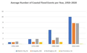
ielts buddy ebooks