IELTS Pie Chart - Global Population Change
by chair mao
(beijing)


The pie charts below give information about world population in 1900 and 2000.
Can anyone check my graph essay?
The pie charts compare the change of global population between 1990 and 2000.
It is clear that there was a significant rise in the total number of world population, from 1.6 billion to 6 billion over a century.
In 1990, Asia accounted for 60% of the world population. Although this number dropped by 6% in 2000, Asia still represented the largest population of the world. European also experienced a fall in its population, from 25% in 1900 to only 14% in 2000; by contrast, the population in both Africa and Latin America increased more than twofold over the 10 decades, with the numbers climbing to 10% and 8% respectively in 2000.
However, in 2000, a new group named Middle East and North Africa was shown up, representing 6% of the global population. Interestingly, the figures for North America and others remained unchanged over the 100-year period, totaling less than 10% in 2000.
Comments for IELTS Pie Chart - Global Population Change
|
||
|
||
|
||
|
||
|
||
IELTS Bar Chart - Global Population Percentages and Distribution of Wealth
by Micky
(Kolkata, West Bengal, India)


Hi! This is the first practice test I've taken in preparation for the IELTS. I would like to be critiqued on this summary I have written of the chart posted along with this. Thanks!
____________________________________________________
There seems to be no correlation between the population of a region and its share of global wealth. North America being the richest continent of the world, with a third of the global wealth has a population roughly a fourth that of China, which has the world's largest population and less than a seventh of North America's wealth.
At the same time, a region's share of wealth is not inversely correlated with its population either - Europe, only second to North America in terms of wealth, has a population almost equal to India, one of the world's poorest regions.
Third in terms of percentage of global wealth are the richer portions of Asia-Pacific, with a population similar to North America and in possesion of a fourth of the global wealth.
When the wealth of a region is compared with its population, North America again emerges in the lead, with richer areas of Asia-Pacific, Europe, and Latin America and the Carribean following; India having the least concentration of wealth amongst its population.
Comments for IELTS Bar Chart - Global Population Percentages and Distribution of Wealth
|
||
|
||

Band 7+ eBooks
"I think these eBooks are FANTASTIC!!! I know that's not academic language, but it's the truth!"
Linda, from Italy, Scored Band 7.5


Bargain eBook Deal!
30% Discount


All 4 Writing eBooks for just $25.86
Find out more >>
IELTS Modules:
Other Resources:


Recent Articles
-
Free IELTS Essay Checker: Instant and No Login Required
Mar 26, 26 08:30 AM
Free IELTS essay checker giving you an instant overall band score, detailed scores for all IELTS writing criteria, example errors, and clear suggestions to improve your Task 2 essay. -
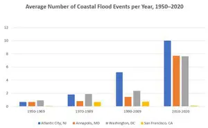
IELTS Bar Chart: Average Number of Coastal Flood Events per Year
Mar 10, 26 05:34 AM
 The chart below shows the number of flood events in four different cities in the United States during four different periods. The bar graph depicts the
 -
Should Everyone Learn English
Mar 10, 26 05:32 AM
I would be pleased if someone could provide feedback. I want to know if my essay well-structured and the exact band. Learning English at school is often

Important pages
IELTS Writing
IELTS Speaking
IELTS Listening
IELTS Reading
All Lessons
Vocabulary
Academic Task 1
Academic Task 2
Practice Tests
Connect with us

Before you go...
30% Discount - Just $25.86 for all 4 Writing eBooks

Copyright © IELTSbuddy All Rights Reserved
IELTS is a registered trademark of University of Cambridge, the British Council, and IDP Education Australia. This site and its owners are not affiliated, approved or endorsed by the University of Cambridge ESOL, the British Council, and IDP Education Australia.