IELTS Line Graph Daily Temperatures
by Sultan
(Kazakhstan)


Hi buddies!
Could you please help me and check the writing task 1 below?
The line graph illustrates what average daily maximum temperatures were registered in comparison between two New Zealand cities – Auckland and Christchurch, and two cities in the UK – London and Edinburgh. The highest average temperatures for New Zealand cities are experienced mostly in winter months, while the hottest period for the United Kingdom is summer.
The graph of the temperatures for New Zealand cities has very strong similarities: both graphs starts from their peak in January with average 22-23 °C temperature. Then the temperatures decline and reach their bottom levels in summer months. After that it becomes warmer and temperature goes upward at the end of the year and raise to 20-21°C in December.
On the other hand, temperatures at the UK cities starts from their lowest levels in January with approximately 7 degrees (Celsius). There is a steady increase, until it reaches the peak with over 20°C and 15°C for London and Edinburgh respectively. Then temperatures decrease constantly and reach another lowest level (5°C) in December.
Comments for IELTS Line Graph Daily Temperatures
|
||
|
||
|
||
|
||
|
||
|
||
|
||

Band 7+ eBooks
"I think these eBooks are FANTASTIC!!! I know that's not academic language, but it's the truth!"
Linda, from Italy, Scored Band 7.5


Bargain eBook Deal!
30% Discount


All 4 Writing eBooks for just $25.86
Find out more >>
IELTS Modules:
Other Resources:


Recent Articles
-
Free IELTS Essay Checker: Instant and No Login Required
Mar 26, 26 08:30 AM
Free IELTS essay checker giving you an instant overall band score, detailed scores for all IELTS writing criteria, example errors, and clear suggestions to improve your Task 2 essay. -
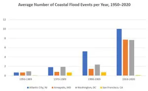
IELTS Bar Chart: Average Number of Coastal Flood Events per Year
Mar 10, 26 05:34 AM
 The chart below shows the number of flood events in four different cities in the United States during four different periods. The bar graph depicts the
 -
Should Everyone Learn English
Mar 10, 26 05:32 AM
I would be pleased if someone could provide feedback. I want to know if my essay well-structured and the exact band. Learning English at school is often

Important pages
IELTS Writing
IELTS Speaking
IELTS Listening
IELTS Reading
All Lessons
Vocabulary
Academic Task 1
Academic Task 2
Practice Tests
Connect with us

Before you go...
30% Discount - Just $25.86 for all 4 Writing eBooks

Copyright © IELTSbuddy All Rights Reserved
IELTS is a registered trademark of University of Cambridge, the British Council, and IDP Education Australia. This site and its owners are not affiliated, approved or endorsed by the University of Cambridge ESOL, the British Council, and IDP Education Australia.