Pie and Line Graph - Spending on Restaurant Meals
by myieltstest


The chart shows the percentage of their food budget the average family spent on restaurant meals in different years. The graph shows the number of meals eaten in fast food restaurants and sit-down restaurants.
hello guys,
could you help me to grade my IELTS task 1 writing?
I appreciate your help.
The pie charts illustrated food budget ratio between dining out and home cooking the typical families spent in four different years from 1970 to 2000 with ten years gap. The ratio had grown progressively in favor of dining out in that period of time.
The family had spent five times more on restaurant meals in 2000 than they did in 1970. In 2000, half of the budget had been spent on restaurant meals while only 10% were spent on it in 1970. While the eating out budget portion increased by 5% and 15% compared from the previous decade in 1980 and 2000, respectively, the significant increasement happened in 1990. The budget had raised by 20% from the previous decade.
While the pie chart depicted the food budget comparison between dining out and eating at home, the line graph represented the number of meals per year of dinning out between the same period of time and the same 10 years gap. It specifically compared between the number of fast food meals eaten per year and the number of sit-down restaurant meals eaten per year, as indicated by solid line and segmented line, respectively. In 1970, the number was the same between of fast food and of sit-down restaurant, which was 40 meals eaten per year. Both numbers increased steadily but the number of fast food meal per year were always bigger from 1970 until the middle of 1980, when both numbers became equal again. From that year onward until 2000, the number of sit-down restaurant meals had increased significantly and had never been surpassed by the number of fast food meals which had been increasing also but not that fast.
Sample 2
by Jemile
(Bulgaria)


Please check it and give me honest feedback!
The charts illustrate the amount of money which were spent on restaurant meals by the average family. The graph provides information about the number of meals which were eaten in sit-down and fast food restaurants,for period of 30 years.
Overall, fast food outweighed cooking at home and eating in sit-down restaurants.
Initially, homemade food was far more popular than junk food,as in 1970 the money used was about 90 per cent. From 1980 declined to just 50% while the money separated for fast food was growing as in 2000 was exactly the half.
The number of meals consumed per year were exactly 20 for both sit-down and junk meals. Both were increasing as between 1980 and 1990 the annual intake was the same again at about 40 times per year. The consumption of fast food increased sharply to reach approximately 90 per year. The intake of sit-down dishes increased slightly to get about 50 intakes annually.
Thank you very much!
PS: the essay is for academic task 1
Comments for Sample 2
|
||
|
||
|
||

Band 7+ eBooks
"I think these eBooks are FANTASTIC!!! I know that's not academic language, but it's the truth!"
Linda, from Italy, Scored Band 7.5


Bargain eBook Deal!
30% Discount


All 4 Writing eBooks for just $25.86
Find out more >>
IELTS Modules:
Other Resources:


Recent Articles
-
Free IELTS Essay Checker: Instant and No Login Required
Mar 26, 26 08:30 AM
Free IELTS essay checker giving you an instant overall band score, detailed scores for all IELTS writing criteria, example errors, and clear suggestions to improve your Task 2 essay. -
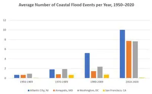
IELTS Bar Chart: Average Number of Coastal Flood Events per Year
Mar 10, 26 05:34 AM
 The chart below shows the number of flood events in four different cities in the United States during four different periods. The bar graph depicts the
 -
Should Everyone Learn English
Mar 10, 26 05:32 AM
I would be pleased if someone could provide feedback. I want to know if my essay well-structured and the exact band. Learning English at school is often

Important pages
IELTS Writing
IELTS Speaking
IELTS Listening
IELTS Reading
All Lessons
Vocabulary
Academic Task 1
Academic Task 2
Practice Tests
Connect with us

Before you go...
30% Discount - Just $25.86 for all 4 Writing eBooks

Copyright © IELTSbuddy All Rights Reserved
IELTS is a registered trademark of University of Cambridge, the British Council, and IDP Education Australia. This site and its owners are not affiliated, approved or endorsed by the University of Cambridge ESOL, the British Council, and IDP Education Australia.