- Home
- Sample Graphs
- Line and Bar Chart
IELTS Line and Bar Chart
This is an example of two graphs together - a line and bar chart.
Often in the IELTS academic task one you are given two graphs or charts rather than one, which means you have to select the information carefully as you may have more to write about than if you were presented with just one.
You should spend about 20 minutes on this task.
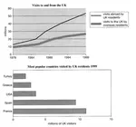
The line graph shows visits to and from the UK from 1979 to 1999, and the bar graph shows the most popular countries visited by UK residents in 1999.
Summarise the information by selecting and reporting the main features and make comparisons where relevant.
Write at least 150 words.

Line and Bar Chart Model Answer
The line graph illustrates the number of visitors in millions from the UK who went abroad and those that came to the UK between 1979 and 1999, while the bar chart shows which countries were the most popular for UK residents to visit in 1999. Overall, it can be seen that visits to and from the UK increased, and that France was the most popular country to go to.
To begin, the number of visits abroad by UK residents was higher than for those that came to the UK, and this remained so throughout the period. The figures started at a similar amount, around 10 million, but visits abroad increased significantly to over 50 million, whereas the number of overseas residents rose steadily to reach just under 30 million.
By far the most popular countries to visit in 1999 were France at approximately 11 million visitors, followed by Spain at 9 million. The USA, Greece, and Turkey were far less popular at around 4, 3 and 2 million visitors respectively.
(Words 171)
Comments
This line and bar chart would get a good score as it meets the requirements of the task.
Note that the introduction mentions both the line and bar chart:
The line graph illustrates the number of visitors in millions from the UK who went abroad and those that came to the UK between 1979 and 1999, while the bar chart shows which countries were the most popular for UK residents to visit in 1999.
The overview also mentions both:
Overall, it can be seen that visits to and from the UK increased, and that France was the most popular country to go to.
The first body paragraph then goes on to explain the data from the line graph, and the second body paragraph presents the data from the bar chart.
View this lesson for further tips and advice on how to describe two graphs together, using the example from this page.
More on a Mix of Graphs:
IELTS Bar and Line Graph: How to describe two graphs together
This Bar and Line Graph example shows you how you can write about two charts together in the IELTS test for task 1, with strategies and techniques.
IELTS Bar and Pie Chart: Organising and describing two charts
This IELTS bar and pie chart provides a model answer with comments and tips to help you answer this type of question in the IELTS test for task 1.
IELTS Line Graph and Pie Chart: Describing two charts together
Explaining an IELTS Line Graph and Pie Chart together is sometimes necessary in the test. Check out an example, model answer and comments given on the graphs.
IELTS Pie and Bar Chart: Two charts combined in one question
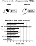
Here you can view an IELTS Pie and Bar Chart together in one question on persons arrested and reasons. In this type of question you should write about each graph in turn. A model answer is provided.
IELTS Pie and Bar Chart: Describing two graphs in a task 1
An IELTS Pie and Bar Chart have been included together in this Task 1 sample. This can cause difficulties for some in the test so view the sample answer to see how to answer this type of graph.
Comments
Any comments or questions about this page or about IELTS? Post them here. Your email will not be published or shared.

Band 7+ eBooks
"I think these eBooks are FANTASTIC!!! I know that's not academic language, but it's the truth!"
Linda, from Italy, Scored Band 7.5


Bargain eBook Deal!
30% Discount


All 4 Writing eBooks for just $25.86
Find out more >>
IELTS Modules:
Other Resources:


Recent Articles
-
Free IELTS Essay Checker: Instant and No Login Required
Mar 26, 26 08:30 AM
Free IELTS essay checker giving you an instant overall band score, detailed scores for all IELTS writing criteria, example errors, and clear suggestions to improve your Task 2 essay. -
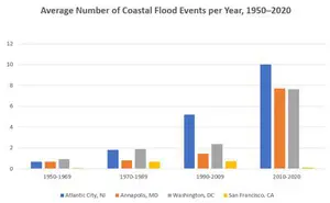
IELTS Bar Chart: Average Number of Coastal Flood Events per Year
Mar 10, 26 05:34 AM
 The chart below shows the number of flood events in four different cities in the United States during four different periods. The bar graph depicts the
 -
Should Everyone Learn English
Mar 10, 26 05:32 AM
I would be pleased if someone could provide feedback. I want to know if my essay well-structured and the exact band. Learning English at school is often

Important pages
IELTS Writing
IELTS Speaking
IELTS Listening
IELTS Reading
All Lessons
Vocabulary
Academic Task 1
Academic Task 2
Practice Tests
Connect with us

Before you go...
30% Discount - Just $25.86 for all 4 Writing eBooks

Copyright © IELTSbuddy All Rights Reserved
IELTS is a registered trademark of University of Cambridge, the British Council, and IDP Education Australia. This site and its owners are not affiliated, approved or endorsed by the University of Cambridge ESOL, the British Council, and IDP Education Australia.