- Home
- Sample Graphs
- IELTS Line Graph Sample Answer
IELTS Line Graph Sample Answer
This IELTS line graph sample answer is about Co2 emissions of four countries over several decades.
It's always important to spend a few minutes thinking about how best to organise and present your answer.
With line graphs, look for similarities and differences with the trends (lines) presented. You may find you can then link patterns together in paragraphs to make your answer logical and organised.
Take a look at the IELTS sample line graph and see how it has been organised. How have things been grouped together?
Model Answer
You should spend about 20 minutes on this task.
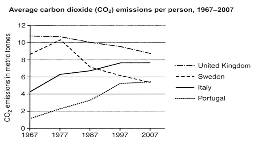
The graph below shows average carbon dioxide (Co2) emissions per person in the United Kingdom, Sweden, Italy, and Portugal between 1967 and 2007.
Summarize the information by selecting and reporting the main features, and make comparisons where relevant.
Write at least 150 words.
IELTS Line Graph Sample Answer
The chart presents the average CO2 emissions per person in four European nations from 1967 to 2007.
Overall, average CO2 emissions of individuals in the UK and Sweden generally dropped, whereas emissions per person in Italy and Portugal rose significantly. Despite the steady reduction, average emissions in the UK were the highest in the given period.
Among the selected countries, the CO2 emissions per person in the UK were the highest throughout the four decades, yet said emissions were on the decline. In 1967, the average emissions per person were nearly 11 metric tonnes. But by 2007, that had fallen to roughly 9 metric tonnes. Somewhat similarly, the average CO2 emissions in Sweden were almost 9 metric tonnes per person in 1967. The emissions spiked, however, to nearly 11 metric tonnes in 1977 though from there, emissions continuously fell, dropping to just 5.5 metric tonnes in 2007.
Conversely, both Italy’s and Portugal’s carbon dioxide emissions per person increased between 1967 and 2007. Italy’s CO2 emissions nearly doubled, starting at just above 4 metric tonnes in 1967 and ending at almost 8 metric tonnes four decades later. Portugal’s CO2 emissions, however, nearly quadrupled. The per capita average in 1967 was just 1.5 metric tonnes. But in 2007, the emissions had reached 5.5 metric tonnes, matching Sweden's average.
(218 Words)
Comments
This IELTS line graph sample answer is good and well-organised.
You hopefully noticed that while emissions from two countries went up during the period, they went down for the other two. So the writer has used this as the basis for the graph's organisation.
This shows the examiner you are able to pick out trends and make clear and logical comparisons.
The writer has also picked out the important things to discuss and there is good use of vocabulary and grammar.
More on IELTS Line Graphs:
IELTS Task 1 Line Graph Structure Using Groups
For an IELTS Task 1 Line Graph there are different ways to organise your answer. Grouping information is a good way to get a logically structured response.
IELTS Line Graph Examples for Academic Task 1: Vehicle Thefts per 1000
IELTS Line Graph Examples - view sample graphs to help you prepare for the IELTS Test. This graph compares car theft. There is a question with a model answer.
Line Graph Quiz
Line Graph Quiz: Have a go at this fun quiz to help you find out what you know about graphs and to help you improve your IELTS score.
IELTS Line Graph Worksheet: Practice the language of change
IELTS Line Graph Worksheet - this is a gap fill to help you practice the language of change for IELTS graphs over time.
IELTS Sample Line Graph
This is an IELTS Sample Line Graph with model answer that you can use to help you prepare to write your answer for a task 1 that describes changes over time.
Tips for Organising an IELTS Line Graph
Organising an IELTS Line Graph - This lesson shows you have to improve the coherency of your graph in order to achieve a high band score.

Comments
Any comments or questions about this page or about IELTS? Post them here. Your email will not be published or shared.

Band 7+ eBooks
"I think these eBooks are FANTASTIC!!! I know that's not academic language, but it's the truth!"
Linda, from Italy, Scored Band 7.5


Bargain eBook Deal!
30% Discount


All 4 Writing eBooks for just $25.86
Find out more >>
IELTS Modules:
Other Resources:


Recent Articles
-
Free IELTS Essay Checker: Instant and No Login Required
Mar 26, 26 08:30 AM
Free IELTS essay checker giving you an instant overall band score, detailed scores for all IELTS writing criteria, example errors, and clear suggestions to improve your Task 2 essay. -
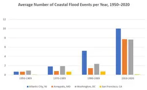
IELTS Bar Chart: Average Number of Coastal Flood Events per Year
Mar 10, 26 05:34 AM
 The chart below shows the number of flood events in four different cities in the United States during four different periods. The bar graph depicts the
 -
Should Everyone Learn English
Mar 10, 26 05:32 AM
I would be pleased if someone could provide feedback. I want to know if my essay well-structured and the exact band. Learning English at school is often

Important pages
IELTS Writing
IELTS Speaking
IELTS Listening
IELTS Reading
All Lessons
Vocabulary
Academic Task 1
Academic Task 2
Practice Tests
Connect with us

Before you go...
30% Discount - Just $25.86 for all 4 Writing eBooks

Copyright © IELTSbuddy All Rights Reserved
IELTS is a registered trademark of University of Cambridge, the British Council, and IDP Education Australia. This site and its owners are not affiliated, approved or endorsed by the University of Cambridge ESOL, the British Council, and IDP Education Australia.