- Home
- Task 1 Lessons & Tips
- Organising an IELTS Line Graph
Organising an IELTS Line Graph
For the IELTS Graphs you need to ensure your answer is well organised. This will be taken into account as part of your coherency and cohesion, which is 25% of the writing grade, so it's very important.
One good reason for having a well-organised response is that it will be much easier for the examiner to read.
And of course, a well-organised and clear response will also lead to a higher band score.
Don't Confuse the Examiner!
One thing you don't want to do is make the examiner get lost or confused when they try to follow what you have written, especially if they have quite a few to mark!
Make it as easy as possible to read, though of course you have to make sure you are still fulfilling the other criteria, such as comparing and contrasting the data and emphasising the key points.
This previous lesson showed you several ways to organise graphs. You need to think about how you will group information together. Doing this will ensure your answer is logical and easy to follow.
A good way which was discussed in the previous lesson is to note down similar or different patterns and describe them together.
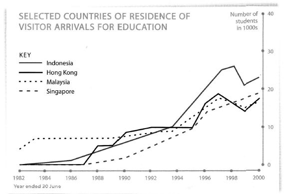
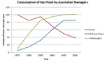
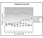
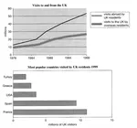
Take a look at this graph, which is comparing the number of visitors from four countries who came to Australia for study from 1982-2000.
In this graph you could for example discuss Indonesia and Hong Kong together, from 1982-2000, as the patterns are fairly similar. Then contrast these with the other two. This is quite a tricky graph though as the patterns all vary quite a lot.
Organising by Time Points
When you look for logical ways to organise your answer, something else you could also look for is whether there is a time point in the graph where everything changes. You can then describe the trends before and after these points.
Take a look at the graph again. Can you see a time point on the graph where things change?
One thing you might notice is that they all reach a similar level of visitors in the mid 1990s (around 10,000), but they all then rise quite sharply after this.
So you could use this as a point of comparison and as a way to divide up your answer. So in the first part of your answer, describe all the countries up until this point, then in the second part describe the trends after this point.
In order to illustrate this, a model answer has been written for the graph below.
Sample Answer
You should spend about 20 minutes on this task.
The graph below shows four countries of residence of overseas students in Australia.
Summarise the information by selecting and reporting the main features, and make comparisons where relevant.
Write at least 150 words.
Model Answer
The line graph shows the residence status of students coming to study in Australia from four different countries, Indonesia, Hong Kong, Malaysia and Singapore. It is evident that over the period, 1982 to 2000, there was a general upward trend in the numbers.
The only country to have students studying in Australia in 1982 was Malaysia, at around 4,000 per year. After an initial increase, the numbers remained fairly steady, reaching approximately 10,000 in 1994. Indonesia, Hong Kong and Singapore followed a similar pattern to each other over this period, rising more sharply once arrivals began until they also stood at around 10,000 per year by the mid-1990s.
After this, all the countries then showed a more rapid increase in arrivals, but this was particularly prominent in Indonesia, which surpassed all the other countries to reach a peak of around 27,000 in 1998, before finishing the highest at 23,000 in 2000. Hong Kong and Malaysia followed the same pattern, fluctuating and finishing at 18,000, whereas Singapore showed a continuous upward trend, reaching just below 20,000 in 2000.
So you can see how the answer is logically divided up. The first body paragraph talking about events prior to the mid-1990s and the second body paragraph the trends after this.
The content in the paragraphs should also be organised in a logical way of course.
Pick the Most Logical Way
The important point to take from this lesson though is to find the most logical and clear way to present the information so it will be easy for someone reading it to follow, but making sure when you do this you don't forget to compare and contrast the data.
There may not be a logical time point to divide up the data, so in this case, simply group trends together and describe them over the full time frame.
Remember there is not a right or wrong way to organise the graph so you can choose how you do it, but it must be organised in a coherent way if you want to get a higher band score.
More Task 1 Academic Lessons:
IELTS Pie Chart Strategies and Tips for a Band 7, 8 or 9
This IELTS pie chart lesson provides you with tips and advice on how to describe an IELTS Pie Chart in order to get a Band 7, 8 or 9.
Which Tenses for IELTS are the Most Important?
Candidates often ask which tenses for IELTS are needed in order to do well in the exam. This lesson goes through the grammar tenses and how they apply to the test.
Learn Compare and Contrast Language for IELTS Graphs
Compare and Contrast Language: In the academic IELTS task 1, you have to know the right language if you want to get a band 7 or higher. Practice your IELTS language for bar charts in this task 1 writing lesson.
IELTS Line Graph Worksheet: Practice the language of change
IELTS Line Graph Worksheet - this is a gap fill to help you practice the language of change for IELTS graphs over time.
IELTS Task 1 Line Graph Structure Using Groups
For an IELTS Task 1 Line Graph there are different ways to organise your answer. Grouping information is a good way to get a logically structured response.


Comments
Any comments or questions about this page or about IELTS? Post them here. Your email will not be published or shared.

Band 7+ eBooks
"I think these eBooks are FANTASTIC!!! I know that's not academic language, but it's the truth!"
Linda, from Italy, Scored Band 7.5


Bargain eBook Deal!
30% Discount


All 4 Writing eBooks for just $25.86
Find out more >>
IELTS Modules:
Other Resources:


Recent Articles
-
Free IELTS Essay Checker: Instant and No Login Required
Mar 26, 26 08:30 AM
Free IELTS essay checker giving you an instant overall band score, detailed scores for all IELTS writing criteria, example errors, and clear suggestions to improve your Task 2 essay. -
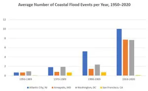
IELTS Bar Chart: Average Number of Coastal Flood Events per Year
Mar 10, 26 05:34 AM
 The chart below shows the number of flood events in four different cities in the United States during four different periods. The bar graph depicts the
 -
Should Everyone Learn English
Mar 10, 26 05:32 AM
I would be pleased if someone could provide feedback. I want to know if my essay well-structured and the exact band. Learning English at school is often

Important pages
IELTS Writing
IELTS Speaking
IELTS Listening
IELTS Reading
All Lessons
Vocabulary
Academic Task 1
Academic Task 2
Practice Tests
Connect with us

Before you go...
30% Discount - Just $25.86 for all 4 Writing eBooks

Copyright © IELTSbuddy All Rights Reserved
IELTS is a registered trademark of University of Cambridge, the British Council, and IDP Education Australia. This site and its owners are not affiliated, approved or endorsed by the University of Cambridge ESOL, the British Council, and IDP Education Australia.