- Home
- Sample Graphs
- Example of a Bar Chart
Example of a bar chart
Here you can view an example of a bar chart for the IELTS test.
This bar chart shows the levels of spending of a family on three household items - gas, food and clothing.
You should note first of all that the bar chart is over time which means you need to use the language of change. You should also make sure that you are comparing and contrasting the items too.
Take a look at the graph and model answer, then view the comments below on the response in order to see how you can improve your answers.
Bar Chart: Monthly Expenditure
You should spend about 20 minutes on this task.
The bar chart shows the monthly spending in dollars of a family in the USA on three items in 2010.
Summarize the information by selecting and reporting the main features and make comparisons where relevant.
Write at least 150 words.

Example of a Bar Chart: Model Answer
The bar chart depicts the monthly expenditure on food, gas and clothing of a family living in the USA in 2010. Overall, it can be seen that levels of expenditure fluctuated over the period.
To begin, in January the most money was spent on food, at approximately $500 per month. Although expenditure on food increased slightly the following month, it then fell to account for the lowest expenditure of all the items at the end of the period at just over $300.
Gas appeared to follow the opposite pattern to food spending. It started lower at about $350 per month, falling in the following month, and then increasing significantly to finish at just under $600 in April.
Clothing, which at just over $200 accounted for the lowest expenditure at the beginning of the period, fluctuated dramatically over the time frame. After reaching around the same levels as food in February (nearly $600), it dropped markedly in March, then jumped to just under $700 in the final month.
With the exception of an increase in March, average spending decreased slightly over the four months.
(183 words)
Comments
This example of a bar chart satisfies the requirements of the task.
The first paragraph introduces the graph (without copying from the rubric) and then identifies the main trends.
It is clearly organized, with each item clearly explained in each paragraph.
Importantly however, even though each item is described in turn, the description does not just describe each item in isolation. You will notice that comparisons are made between the items throughout the description.
For example:
- ...it then fell to account for the lowest expenditure of all the items at the end of the period...
- Gas appeared to follow the opposite pattern to food spending.
- Clothing, which at just over $200 accounted for the lowest expenditure at the beginning of the period,...
There is also evidence that the candidate knows how to write complex sentences:
- Although expenditure on food increased...
- Clothing, which at just over...
- After reaching...
There is also a good mix of comparison / compare sentence structures and language of change. The correct tense is used (past simple) as the graph is referring to completed actions in the past.
More on IELTS Bar Charts:
IELTS Bar Chart: Model answer with comments and tips
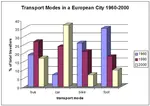
This sample IELTS bar chart is a graph over time depicting the changing modes of transport in a European city. There is a model answer.
Writing Task 1 Bar Chart Sample: Organising your response
This writing task 1 bar chart sample provides a model answer that would achieve a high score in the IELTS test. A key to a high score is a well-organised response.
IELTS Bar Chart Sample: Applying the Language of Change
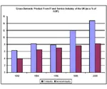
This sample IELTS bar chart shows the components of GDP in the UK. The graph is over time so you have to use the language of change as well as contrasting.
IELTS Bar Graph: Model answer with tips and comments
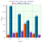
View an IELTS Bar Graph sample answer for IELTS writing task 1. This graph shows the scores of three different teams over four difference seasons.
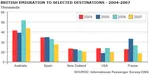
IELTS Bar Graph: British emigration to selected destinations
This IELTS Bar Graph shows British Emigration to selected destinations between 2004 and 2007. Improve your IELTS Score by viewing model task 1 answers.
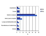
Bar Chart Exercise: Language of comparison, contrast and percentages
Bar Chart Exercise: This is a gap fill to help you answer a question for the IELTS Task 1. In the chart it is essential that you know which language to use and how. This bar chart practice provides you with the skills to do this.
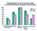
IELTS Bar Chart Example: Participation in leisure activities
IELTS Bar Chart Example on the participation of 5-14 year old Australians in leisure activities. View a model answer.
Comments
Any comments or questions about this page or about IELTS? Post them here. Your email will not be published or shared.

Band 7+ eBooks
"I think these eBooks are FANTASTIC!!! I know that's not academic language, but it's the truth!"
Linda, from Italy, Scored Band 7.5


Bargain eBook Deal!
30% Discount


All 4 Writing eBooks for just $25.86
Find out more >>
IELTS Modules:
Other Resources:


Recent Articles
-
Free IELTS Essay Checker: Instant and No Login Required
Mar 26, 26 08:30 AM
Free IELTS essay checker giving you an instant overall band score, detailed scores for all IELTS writing criteria, example errors, and clear suggestions to improve your Task 2 essay. -
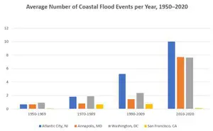
IELTS Bar Chart: Average Number of Coastal Flood Events per Year
Mar 10, 26 05:34 AM
 The chart below shows the number of flood events in four different cities in the United States during four different periods. The bar graph depicts the
 -
Should Everyone Learn English
Mar 10, 26 05:32 AM
I would be pleased if someone could provide feedback. I want to know if my essay well-structured and the exact band. Learning English at school is often

Important pages
IELTS Writing
IELTS Speaking
IELTS Listening
IELTS Reading
All Lessons
Vocabulary
Academic Task 1
Academic Task 2
Practice Tests
Connect with us

Before you go...
30% Discount - Just $25.86 for all 4 Writing eBooks

Copyright © IELTSbuddy All Rights Reserved
IELTS is a registered trademark of University of Cambridge, the British Council, and IDP Education Australia. This site and its owners are not affiliated, approved or endorsed by the University of Cambridge ESOL, the British Council, and IDP Education Australia.