- Home
- Sample Graphs
- Ielts Bar Graph
Sample IELTS Bar Graph
This is a model of an IELTS bar graph. The topic is team scores.
In a bar graph data is organised into columns showing the data. In this case the information is over time so you have to use the language of change to describe the data.
You should spend about 20 minutes on this task.
The bar chart shows the scores of teams A, B and C over four different seasons.
Summarize the information by selecting and reporting the main features and make comparisons where relevant.
Write at least 150 words.

IELTS Bar Graph - Model Answer
The bar chart shows the scores of three teams, A, B and C, in four consecutive seasons. It is evident from the chart that team B scored far higher than the other two teams over the seasons, though their score decreased as a whole over the period.
In 2002, the score of team B far exceeded that of the other two teams, standing at 82 points compared to only 10 for team C and a very low 5 for team A. Over the next two years, the points for team B decreased quite considerably, dropping by around half to 43 by 2004, but they still remained above the points for the other teams.
However, though team A and C's points were lower, they were rising. Team A’s points had increased by 600% from 2002 to reach 35 points by 2004, nearly equal to team B. Team C, meanwhile, had managed only a small increase over this time.
In the final year, team B remained ahead of the others as their points increased again to 55, while team A and C saw their point scores reverse and drop to 8 and 5 respectively.
(Words 164)
Comments
The largest or biggest data is not always the most important but in this case you should see that what stands out above everything else is the size of Team B. It's much higher than the others throughout the period.
So in this case this is likely to be a good piece of information to select for the overview (the main trend of the IELTS bar graph):
It is evident from the chart that team B scored far higher than the other two teams over the seasons, though their score decreased as a whole over the period.
It is then important in your description to pick out the main features and make comparisons as you are told to do in the prompt.
What you should not miss as they are likely to be seen to be key features by the examiner are:
- The relative size of B over the other teams
- It's steep drop over the first three years
- The sudden rise in Team A in 2004 and its steep drop again
The importance of Team B in this IELTS bar graph is highlighted in the first body paragraph, with detail on how it remained high and above the other two teams.
It is then pointed out how Team A and C's points increased, especially A, then fell again, while Team B rose again at the end after falling.
So the IELTS bar graph picks out the key features of the graph and makes comparisons, which are important for a good score.
Learn more about how to respond to a graph over time.
As with all graphs and charts, you will also need to make sure you are comparing and contrasting the data.
More on IELTS Bar Charts:
Writing Task 1 Bar Chart Sample: Organising your response
This writing task 1 bar chart sample provides a model answer that would achieve a high score in the IELTS test. A key to a high score is a well-organised response.
IELTS Bar Chart: Model answer with comments and tips
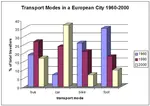
This sample IELTS bar chart is a graph over time depicting the changing modes of transport in a European city. There is a model answer.
Example of a bar chart for IELTS: Comparisons between the categories
This is an example of a bar chart for IELTS with a model answer. The response highlights the importance of making comparisons between categories.
IELTS Bar Chart Sample: Applying the Language of Change
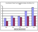
This sample IELTS bar chart shows the components of GDP in the UK. The graph is over time so you have to use the language of change as well as contrasting.
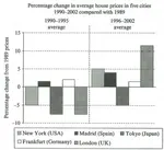
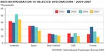
IELTS Bar Graph: British emigration to selected destinations
This IELTS Bar Graph shows British Emigration to selected destinations between 2004 and 2007. Improve your IELTS Score by viewing model task 1 answers.
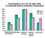
IELTS Bar Chart Example: Participation in leisure activities
IELTS Bar Chart Example on the participation of 5-14 year old Australians in leisure activities. View a model answer.
Bar Chart Exercise: Language of comparison, contrast and percentages
Bar Chart Exercise: This is a gap fill to help you answer a question for the IELTS Task 1. In the chart it is essential that you know which language to use and how. This bar chart practice provides you with the skills to do this.
Comments
Any comments or questions about this page or about IELTS? Post them here. Your email will not be published or shared.

Band 7+ eBooks
"I think these eBooks are FANTASTIC!!! I know that's not academic language, but it's the truth!"
Linda, from Italy, Scored Band 7.5


Bargain eBook Deal!
30% Discount


All 4 Writing eBooks for just $25.86
Find out more >>
IELTS Modules:
Other Resources:


Recent Articles
-
Free IELTS Essay Checker: Instant and No Login Required
Mar 26, 26 08:30 AM
Free IELTS essay checker giving you an instant overall band score, detailed scores for all IELTS writing criteria, example errors, and clear suggestions to improve your Task 2 essay. -
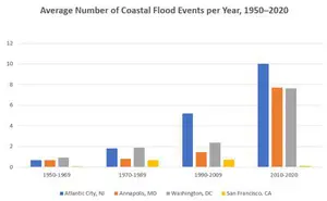
IELTS Bar Chart: Average Number of Coastal Flood Events per Year
Mar 10, 26 05:34 AM
 The chart below shows the number of flood events in four different cities in the United States during four different periods. The bar graph depicts the
 -
Should Everyone Learn English
Mar 10, 26 05:32 AM
I would be pleased if someone could provide feedback. I want to know if my essay well-structured and the exact band. Learning English at school is often

Important pages
IELTS Writing
IELTS Speaking
IELTS Listening
IELTS Reading
All Lessons
Vocabulary
Academic Task 1
Academic Task 2
Practice Tests
Connect with us

Before you go...
30% Discount - Just $25.86 for all 4 Writing eBooks

Copyright © IELTSbuddy All Rights Reserved
IELTS is a registered trademark of University of Cambridge, the British Council, and IDP Education Australia. This site and its owners are not affiliated, approved or endorsed by the University of Cambridge ESOL, the British Council, and IDP Education Australia.