- Home
- Sample Graphs
- Sample Pie Chart
Sample Pie Chart - IELTS Task 1
This is a sample pie chart for IELTS task 1.
In this example, there are four pie charts that you have to compare, which makes it quite difficult. So you need to decide the best way to structure your answer to make it easy to read and follow.
Model Graph
You should spend about 20 minutes on this task.
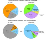
The pie charts show the electricity generated in Germany and France from all sources and renewables in the year 2009.
Summarise the information by selecting and reporting the main features and make comparisons where relevant.
Write at least 150 words.

Sample Pie Chart - Model Answer
The four pie charts compare the electricity generated between Germany and France during 2009, and it is measured in billions kWh. Overall, it can be seen that conventional thermal was the main source of electricity in Germany, whereas nuclear was the main source in France.
The bulk of electricity in Germany, whose total output was 560 billion kWh, came from conventional thermal, at 59.6%. In France, the total output was lower, at 510 billion kWh, and in contrast to Germany, conventional thermal accounted for just 10.3%, with most electricity coming from nuclear power (76%). In Germany, the proportion of nuclear power generated electricity was only one fifth of the total.
Moving on to renewables, this accounted for quite similar proportions for both countries, ranging from around 14% to 17% of the total electricity generated. In detail, in Germany, most of the renewables consisted of wind and biomass, totaling around 75%, which was far higher than for hydroelectric (17.7%) and solar (6.1%). The situation was very different in France, where hydroelectric made up 80.5% of renewable electricity, with biomass, wind and solar making up the remaining 20%. Neither country used geothermal energy.
(191 Words)
Comments
In order to make the answer clear, the writer has organised the chart by categories and types of energy.
So the first body paragraph compares 'All Types' for both countries, and examines each energy in turn, before moving on to 'Renewables' and doing the same thing.
This makes it easy to read and follow, meaning that it will get a good score for it's cohesion and coherence, but also for Task Response as this method means there is plenty of comparison between the countries and energy types.
Still unsure about this type of chart? There is a great lesson here on how to write IELTS Pie Charts.
More on IELTS Pie Charts:
IELTS Pie Chart Exercise: Improve your language flexibility
With this IELTS pie chart exercise you can Improve your language and grammar for writing about Task One charts. The focus is on comparing and on 'proportions'.
Task 1 Pie Chart: Using the past and future tenses
Task 1 pie chart for IELTS with model answer and tips on how to develop a high-scoring response to this type of chart. You need to use past and future tenses.
Writing Task 1 Pie Chart: Describing two pie charts over time
Writing Task 1 Pie Chart: This sample chart compares the structure of a company in terms of the ages of the workforce.
IELTS Pie Chart Strategies and Tips for a Band 7, 8 or 9
This IELTS pie chart lesson provides you with tips and advice on how to describe an IELTS Pie Chart in order to get a Band 7, 8 or 9.
Comments
Any comments or questions about this page or about IELTS? Post them here. Your email will not be published or shared.

Band 7+ eBooks
"I think these eBooks are FANTASTIC!!! I know that's not academic language, but it's the truth!"
Linda, from Italy, Scored Band 7.5


Bargain eBook Deal!
30% Discount


All 4 Writing eBooks for just $25.86
Find out more >>
IELTS Modules:
Other Resources:


Recent Articles
-
Free IELTS Essay Checker: Instant and No Login Required
Mar 26, 26 08:30 AM
Free IELTS essay checker giving you an instant overall band score, detailed scores for all IELTS writing criteria, example errors, and clear suggestions to improve your Task 2 essay. -
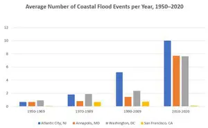
IELTS Bar Chart: Average Number of Coastal Flood Events per Year
Mar 10, 26 05:34 AM
 The chart below shows the number of flood events in four different cities in the United States during four different periods. The bar graph depicts the
 -
Should Everyone Learn English
Mar 10, 26 05:32 AM
I would be pleased if someone could provide feedback. I want to know if my essay well-structured and the exact band. Learning English at school is often

Important pages
IELTS Writing
IELTS Speaking
IELTS Listening
IELTS Reading
All Lessons
Vocabulary
Academic Task 1
Academic Task 2
Practice Tests
Connect with us

Before you go...
30% Discount - Just $25.86 for all 4 Writing eBooks

Copyright © IELTSbuddy All Rights Reserved
IELTS is a registered trademark of University of Cambridge, the British Council, and IDP Education Australia. This site and its owners are not affiliated, approved or endorsed by the University of Cambridge ESOL, the British Council, and IDP Education Australia.